Visualization
Showing the stories in data through statistics, design, aesthetics, and code.
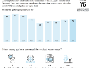
Drought report cards for California water districts
Thomas Suh Lauder for the Los Angeles Times provides you with a way…
Working with R at the New York Times
Amanda Cox from the New York Times was on the Data Stories podcast.…
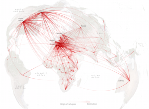
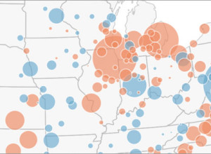
Refugee migration mapped globally
According to estimates recently released by the United Nations, about 14 million left…
Entire English Wikipedia in physical print
The exhibit From Aaaaa! to ZZZap! opened last week with a hit of…
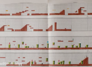
Super Mario Bros. was designed on graph paper
Leading up to the release of Super Mario Maker, which lets you create…
Quick reference guide to thematic cartography
Mapping data is so much about subtleties. The little things add up to…
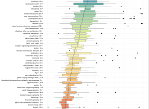
Length of the average master’s thesis
A while back beckmw found the average length of a dissertation for various…
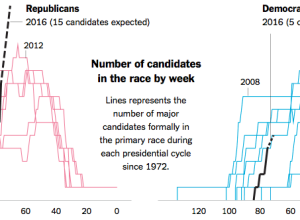
More presidential candidates please
“If it seems as if the list of presidential candidates for 2016 is…
Endangered species depicted with geometric pieces
In Pieces by designer Bryan James is an animated piece that uses simple…
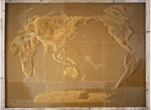
Getting bees to construct geographic maps
In an exploration of the connection between humans an nature, artist Ren Ri…
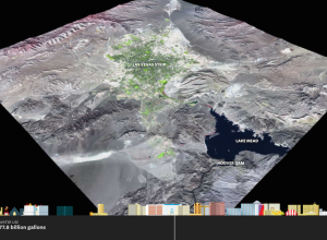
Growth of Las Vegas metro and skyline
Western cities are growing but water supplies are decreasing. That’s not good. ProPublica,…
Chess piece moving patterns
Million Base is a database of 2.2 million chess games. Steve Tung visualized…
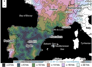
From European cities, how long it takes to travel elsewhere
After seeing an isochrone map drawn by Francis Galton, Peter Kerpedjiev was curious…
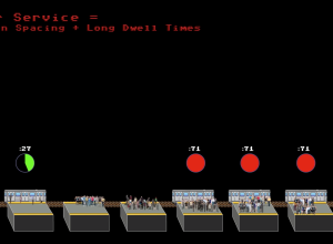
Why the subway isn’t getting a move on already
You’re headed to the subway platform and you hear a train coming. The…

