Visualization
Showing the stories in data through statistics, design, aesthetics, and code.
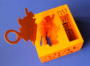
3-D paper model of a shrinking sea
The Aral Sea in Uzbekistan, formerly one of the largest lakes in the…
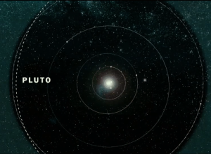
If the Moon were one pixel in size
Somehow these space-in-perspective graphics and interactives never get old. I guess the size…
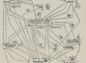
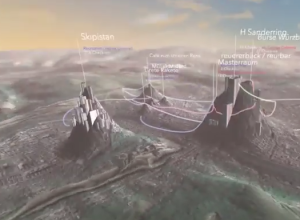
Disney business strategy chart, 1957
This is Walt Disney’s corporate strategy from 1957. The theatrical films serve as…
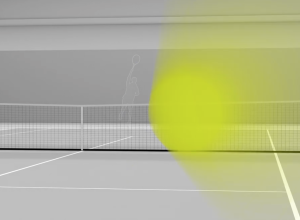
See a 150mph tennis serve to your face
Hawk-Eye is a collection of technologies that allows high-granularity sports tracking, most notably…
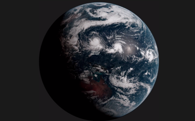
Earth time-lapse from 22,000 miles out
Japan has a new weather satellite in stationary orbit, Himawari-8, that takes a…
How we created an interactive map of Europe with 100k+ areas →
A lot of boundary areas, but still loads quickly.…
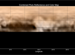
Pluto reflectance map: Whale and the Donut
Using images taken by New Horizons between June 27 and July 3, this…
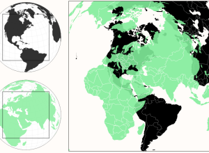
A more realistic perspective of country sizes
Most of us have seen the True Size of Africa graphic that squishes…
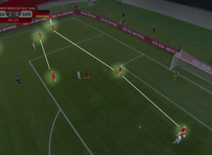
U.S. women’s soccer gameplan
I know next to nothing about soccer. Like there’s nothing, and then I’m…

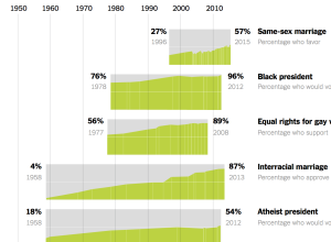
Comparison of shifted public opinion
David Leonhardt and Alicia Parlapiano compared public opinion over time for various social…
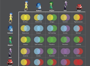
Combining Inside Out emotions for new ones
Spoiler alert for Inside Out. At the climax of the movie, we see…
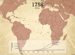
Animated map shows Trans-Atlantic slave trade
The Trans-Atlantic Slave Trade Database provides records for thousands of voyages between the…
Data into art and connecting to humans
Visualization tends to rest in the realm of efficiency and accuracy. From a…
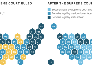
Same-sex marriage legalized in all states
The Supreme Court legalized gay marriage today. NPR shows before and after the…