Visualization
Showing the stories in data through statistics, design, aesthetics, and code.
Send map tiles to 3-D printer
Mapzen, which offers a vector tile service, made Tile Exporter, so that you…
Hurricane simulations show severe flooding in Houston
In 2008, Hurricane Ike blew just past the Houston Ship Channel, “home to…
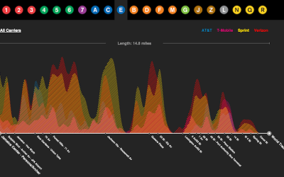
Cell reception on the subway, mapped
Daniel Goddemeyer and Dominikus Baur grew interested in cell reception while on the…
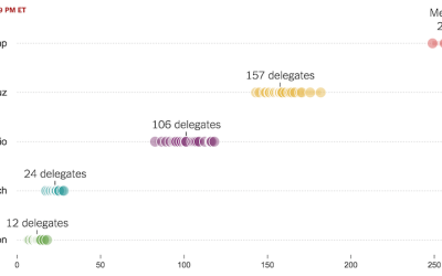
Super Tuesday simulation to show uncertainty
As we know, there are various outcomes during election season, with uncertainty in…
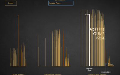
Impact of Best Picture Oscar nomination on profit
I think the general assumption is that getting an Oscar nomination for Best…
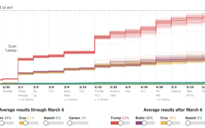
Possible paths for a Trump nomination loss or win
It pains me to imagine a time when Donald Drumpf earns a Republican…
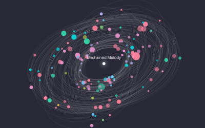
Code as microorganism
Taking a step beyond 2-D glyphs, Codeology depicts GitHub user activity based on…
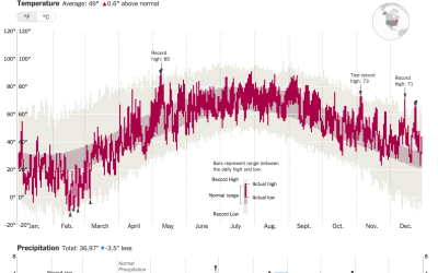
How much warmer your city was in 2015
It was hotter in 2015 than any other year ever. K. K. Rebecca…
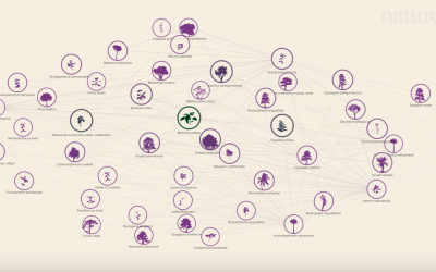
Social network of Earth’s plants and animals
Plants and animals interact with each other to stay alive, which in turn…
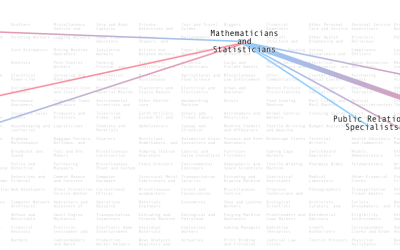
Who marries who, by profession
People with certain professions tend to marry others with a given profession. Adam…
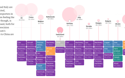
International impact of China’s economic slowdown
China’s economic slowdown means a major decline in imports from other countries, which…
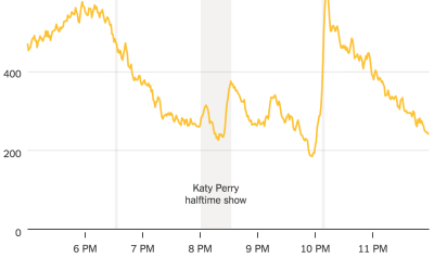
Taxi ride volume during Super Bowl key moments
A high percentage of Americans are glued to the television or party sample…
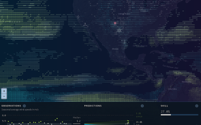
Wind prediction and potential power
As we use up current energy resources, it grows more important to look…
Small multiples for NBA game differentials
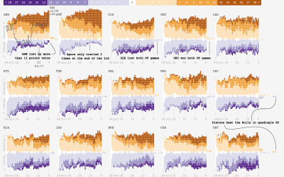
Adam Pearce charted minute-by-minute point differentials for NBA games during the 2014-15 season.…
Same source, different styles →
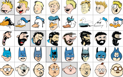
Jaakko Seppälä drew ten comic characters, each in its original style and in…


