Visualization
Showing the stories in data through statistics, design, aesthetics, and code.
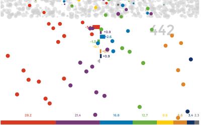
Titanic sinking in real-time
Visualization of time is usually about compression so that you can see more…
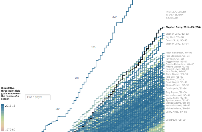
Stephen Curry 3-point record ridiculousness
Stephen Curry made 402 three-pointers this regular season, which is ridiculous. Gregor Aisch…
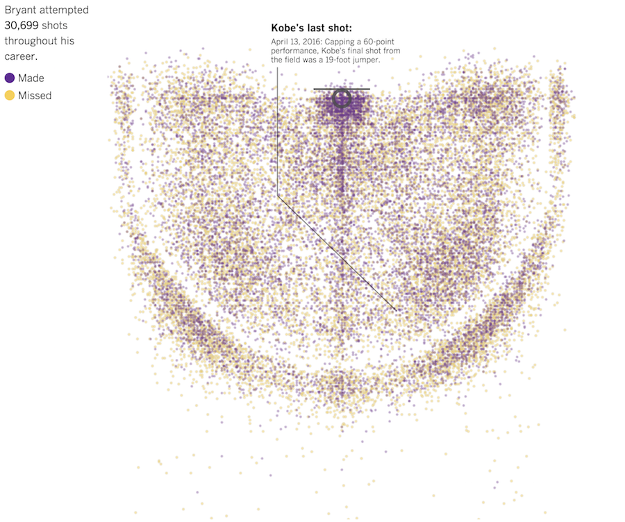
Every Kobe Bryant shot charted
In celebration of Kobe Bryant’s final game, the Los Angeles Times charted all…
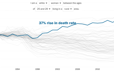
Rising death rates for white women
Overall life expectancy continues to increase, but looking at it from the other…
US surveillance flight paths for the FBI and Homeland Security
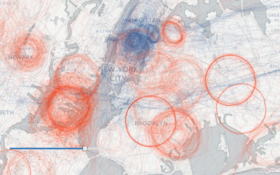
Peter Aldhous and Charles Seife dug into flight path data, specifically looking for…
A visual recreation of the Porsche driving experience
This is beautiful work by digital art and design studio onformative. They recreate…
Flyover Country app tells you about the ground beneath as you fly
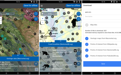
Before your next flight, road trip, or hike, download the Flyover Country app…
Changing river path seen through satellite images
Sedimentary geologist Zoltan Sylvester downloaded Landsat data using Earth Explorer and strung together…
Coastline across the ocean, from where you’re standing
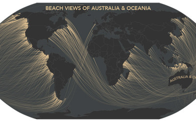
A couple of years ago, Eric Odenheimer wondered: If you stand on the…
Tarot cards for complex network concepts
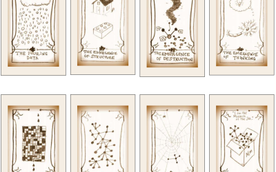
Peter Dodds teaches a course on complex networks, and he put together a…
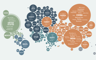
Regional news coverage around the world
Popular news topics change depending on where you are, as what’s important to…
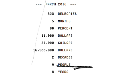
Counting the numbers in the news
Truth & Quantity by Gregor Hochmuth is what happens when you strip out…
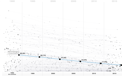
Greater access to clean water
National Geographic, in collaboration with Bestiario, looks at the improving accessibility to clean…
Simulation shows why polls don’t always match future results
With election season in full swing, as far as the news is concerned…


