Visualization
Showing the stories in data through statistics, design, aesthetics, and code.


Cross-country road trip at a constant 70 degrees
Road trips are fun, but it can be hard to enjoy yourself when…

History lesson on data visualization
Clive Thompson for Smithsonian Magazine gives a quick history lesson on infographics.
[D]ata…
One year as a Data Scientist at Stack Overflow →
Detailed description of what it’s like for someone with a stat-heavy background.…

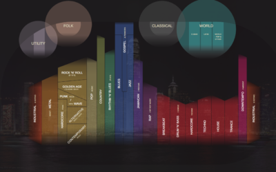
Charted history of music, from its origins to present
Musicmap is an attempt to show the history of music over time and…

Growth of cities, going back 6,000 years
Meredith Reba, Femke Reitsma and Karen C. Seto compiled a dataset of urban…

Procedurally generated spaceships
Video game developer Michael Davies provides a Blender script to procedurally generate pretty…

Sci-Fi short film scripted by machine learning algorithm
Filmmaker Oscar Sharp and technologist Ross Goodwin fed a machine learning algorithm with…

What happened at Pulse in Orlando
The Tampa Bay Times takes you through a 3-D model of Pulse Nightclub…
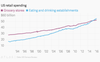
We spend more at restaurants than at grocery stores
For decades, Americans spent more money at the grocery store than at eating…

Motion capture dance
Really fun. “Motion capture, procedural animation and dynamic simulations combine to create a…

U.S. gun deaths rate is an outlier
If you look at gun death rates for other western countries and adjust…

Voting habits for various demographic groups
Voter turnout and political leanings for various demographic groups play an important role…
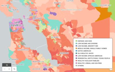
A map about the people who live there
Geographers Seth Spielman and Alex Singleton used something called “geodemographic classification” to classify…

Play chess against the machine and see what it’s thinking
The Thinking Machine, by Martin Wattenberg and Marek Walczak, shows you the thought…
Where people go to and from work
With an animated take on the commute map, Mark Evans shows where people…

Game of Thrones discussions for every episode, visualized
I hear there’s some show called “Game of Thrones” that’s kind of popular…