Visualization
Showing the stories in data through statistics, design, aesthetics, and code.
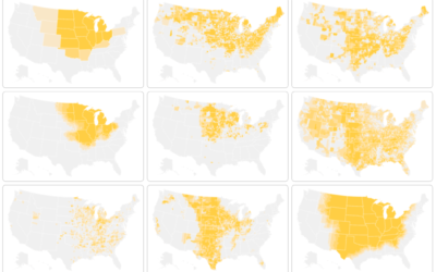
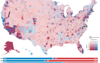
Looking for America’s heartland
By definition, heartland is some central place of importance of a country. But…
U.S. culture through TV show geography
Map who “likes” television shows on Facebook, by ZIP code, and you get…
Where people use certain words
Nikhil Sonnad for Quartz mapped the top 100,000 words used in tweets. Search…
Following the carbon dioxide
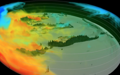
This animated visualization from NASA Goddard Space Flight Center shows a model of…
Listen to radio around the globe
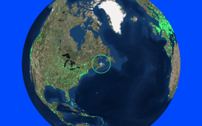
Here’s a fun piece called Radio Garden. It’s exactly what the title says.…
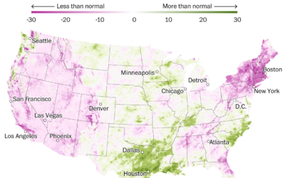
Houston flooding on the rise
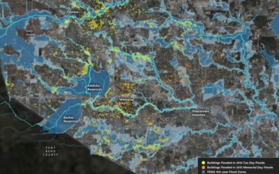
Climate change is doing some weird stuff. What were once rare weather events…
Electoral college and state population representation weights
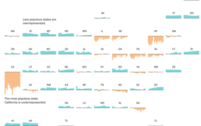
By design, the electoral college and population don’t quite match up state-by-state. This…
Random states of America show changing election outcomes
Geography and state borders play a big part in how elections play out…
New region boundaries based on commutes
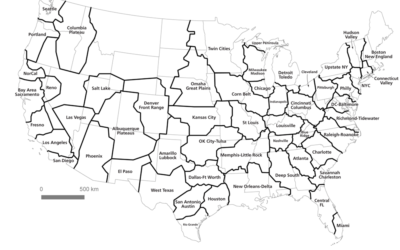
Geographers Alasdair Rae and Garrett Nelson used commuting data from the American Community…
An average life as interpretive dance
BuzzFeed used interpretive dance to describe the average age of the milestones in…
Physical demo of how all maps are wrong
We’ve seen many one-off projects that show the distortions you get when you…
Detailed time-lapse of everywhere on Earth
A few years back, Google released a time-lapse feature in Google Earth that…
Typeface interweaves words and graphs
Datalegreya is a new typeface by Fig that lets you intertwine a graph…

