Visualization
Showing the stories in data through statistics, design, aesthetics, and code.
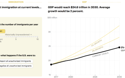
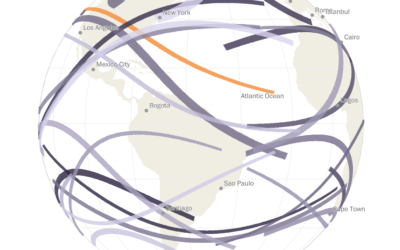
Boost economy with immigration
Want to increase the GDP? Easy. Let more immigrants in. Lena Groeger for…
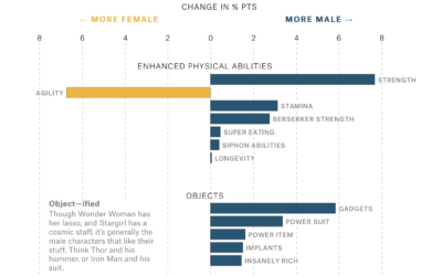
Gender representation in comic books
Amanda Shendruk for The Pudding analyzed how genders are represented differently in comic…
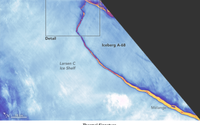
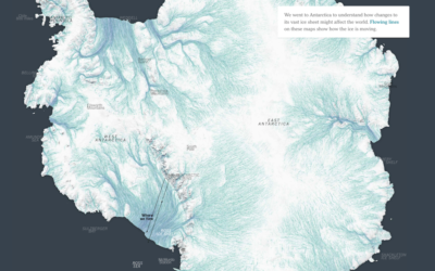
Detailed satellite view of iceberg break
Using the thermal signature, NASA provides a detailed view of the break:
The…

Hidden oil patterns on bowling lanes
This explainer video by Vox on the oil patterns on bowling lanes was…
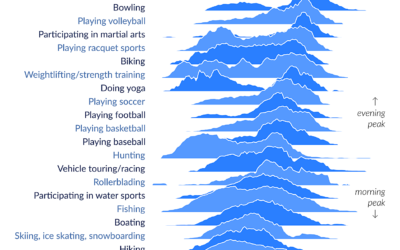
Peak times for leisure and sports
The American Time Use Survey asks people what they do during the day.…
Every solar eclipse in your lifetime
The continental United States gets a total solar eclipse on August 21, so…

Infinite Twitter ad campaign, based on data profiles
As you probably know, Twitter (and all social media) collects data about you…

Temperature simulation near the Earth’s core
Researchers are building models to simulate the Earth’s core. From CNRS News:
Take…
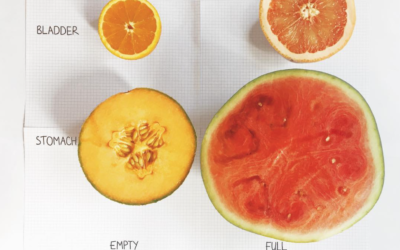
Empty bladder vs. full bladder
I always enjoy the data sketches that Mona Chalabi posts on Instagram. She…
Australia as 100 people
Opting for the force-directed clusters route, Catherine Hanrahan and Simon Elvery for ABC…
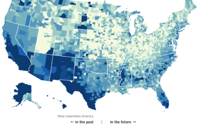
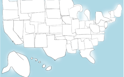
Parts of America that most resemble the future
The Census Bureau released estimates for demographic breakdowns for each county — in…
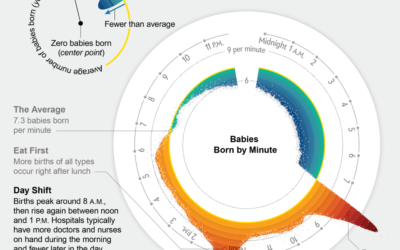
When babies are born, the cycle
Movies would have you believe that birth is random and unpredictable. (And if…

A thousand ways to draw a thing
Google released the Quick, Draw! dataset, so the closer looks at the collection…

Looking for cultural expression in 50 million doodles
Using Google’s Quick Draw dataset, a collection of 50 million drawings across 345…

Mappings for Choose Your Own Adventure books
Every now and then there’s a visual exploration of the Choose Your Own…
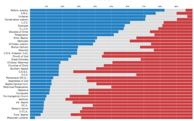
Politics of religious leaders
Kevin Quealy for The Upshot looks at political party registration of religious leaders,…