Visualization
Showing the stories in data through statistics, design, aesthetics, and code.
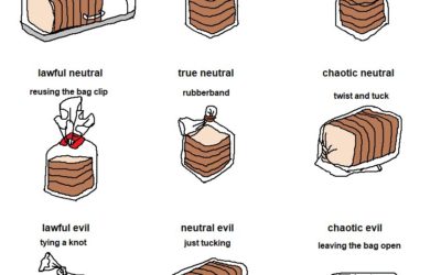
Bread bag alignment chart
From @aurelianrabbit, the bread bag alignment chart. Lawful neutral, right here.…
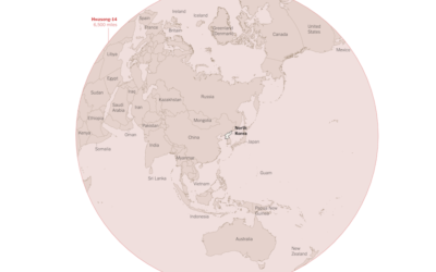
Where North Korea can reach with its missiles
Troy Griggs and Karen Yourish for The New York Times mapped the estimated…
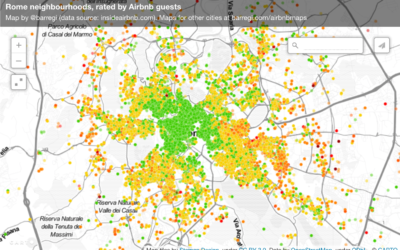
Perception of neighborhoods through Airbnb ratings
Beñat Arregi made a series of Airbnb maps with a simple premise. If…
Karate-inspired projection mapping
I have no idea how projection mapping works, so it kind of feels…
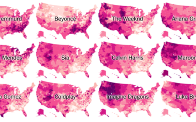
Music preference geography
Travel to different parts of the country, and you hear different types of…
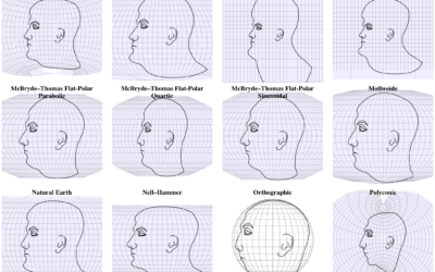
Interactive shows map projections with a face
We’ve seen faces as map projections before, but this is 63 projections on…
Boeing draws a plane in the sky with flight path
In a test flight, Boeing took the thing where you draw using your…
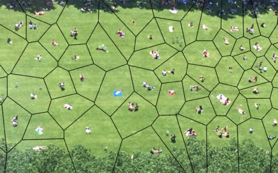
Voronoi diagram of people in the park
From Rod Bogart, a Voronoi diagram of people sitting in Bryant Park. It’s…
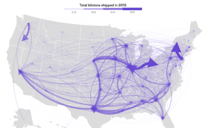
Flow of goods between states
Using data from the Freight Analysis Framework, Chris Canipe for Axios mapped the…
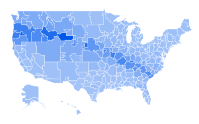
Google Trends eclipse interest
I feel like the large-volume coverage of the upcoming eclipse doesn’t quite match…
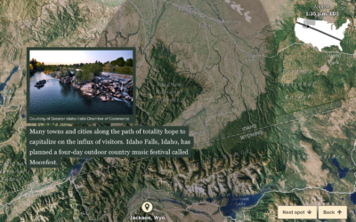
Satellite view of the upcoming eclipse’s path
In case you didn’t hear, a solar eclipse is on the way that…
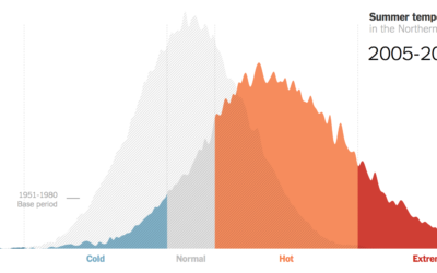
Hotter and hotter summers, extremely hot
Climate scientist James Hansen and team looked at summer temperatures over several decades.…
Why automation is different this time
Since forever, we’ve tried to make jobs easier. More automated. In many cases,…
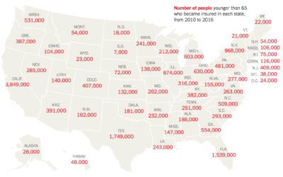
How many people might lose health insurance
The Urban Institute estimated how many people in each state gained health insurance…
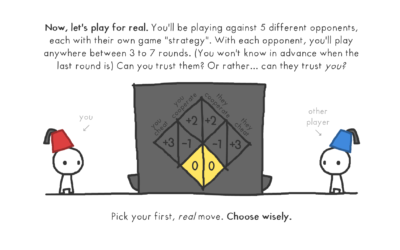
Explaining the evolution of trust with game theory
Nicky Case, who has a knack for making complex topics playfully fun, delves…
Charting bird egg shapes, and why so many varieties
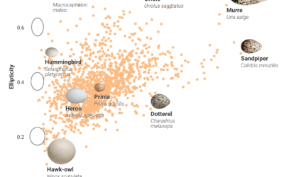
Bird eggs come in all shapes and sizes, and people didn’t really know…
An interactive to explain histograms, for normal people
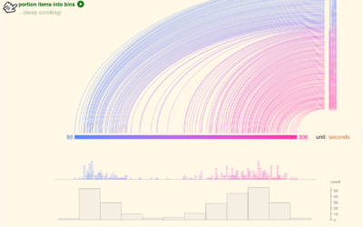
Histograms require some statistical knowledge to grasp, and without the tidbits, the distribution…

