Projects
Graphics by Nathan Yau, borne out of everyday curiosities, learning experiments, and mild insomnia.

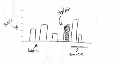
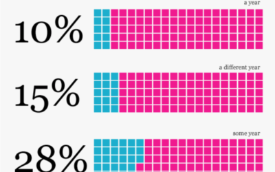
Graph Design Rule #2: Explain your encodings
This is part two in a seven-part series on basic rules for graph…

Graph Design Rule #1: Check the data
Now that we’ve covered the 7 basic rules to graph design, it’s time…
7 Basic Rules for Making Charts and Graphs
Charts and graphs have found their way into news, presentations, and comics, with…
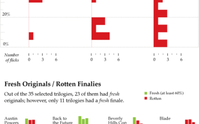
Do Movie Sequels Live Up to Their Originals?
The third installment of Pixar’s Toy Story is making a killing at the…
Data Underload #21: Exit Strategy
If my wife, the physician, has taught me anything, it’s that everything that…
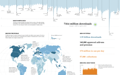
The Boom of Big Infographics
Big information graphics have been around for a long time. They’ve come in…
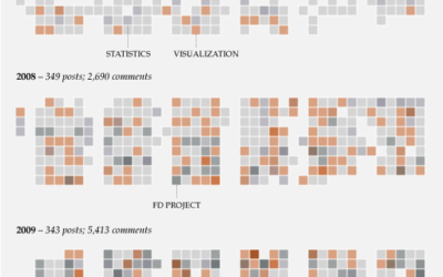
Data Underload: One Thousand Posts
On June 25, 2007 I published the first FlowingData post. Today, here is…
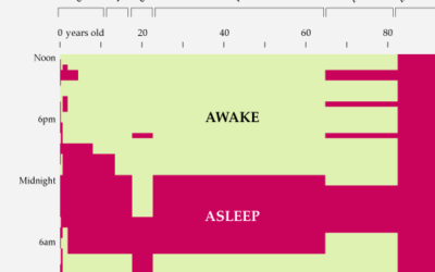
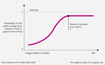
Data Underload #18 – Sleep Schedule
According to WebMD, for 1- to 4-week-olds: “Since newborns do not yet have…
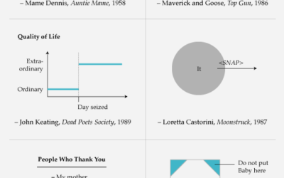
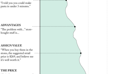
Data Underload #17: Famous Movie Quotes, p. 2
Carpe diem. Seize the data, boys. Make your lives extraordinary.…
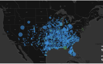
Watching the Growth of Walmart
The ever so popular Walmart growth map gets an update, and yes, it still looks like a wildfire. Sam's Club follows soon after, although not nearly as vigorously.
Data Underload #14 – Popeil Pitch
As corny as the Ronco infomercials are, you can’t help but stop and…