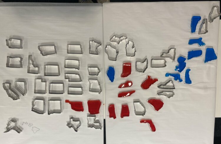
The Bloomberg Graphics desk is building out a jello map as states are called. Because sure why not.
Become a member. Support an independent site. Make great charts.
See what you get →
Using an oldie but goodie visualization format to look at time use between different groups.
Every day is a bit different, but here is a wideout view of how Americans spend their days. Compare with your own time use.
These are the top 250 products that people injure themselves on or with in a year.
A dollar might not buy you as much in one state as it does in the other.