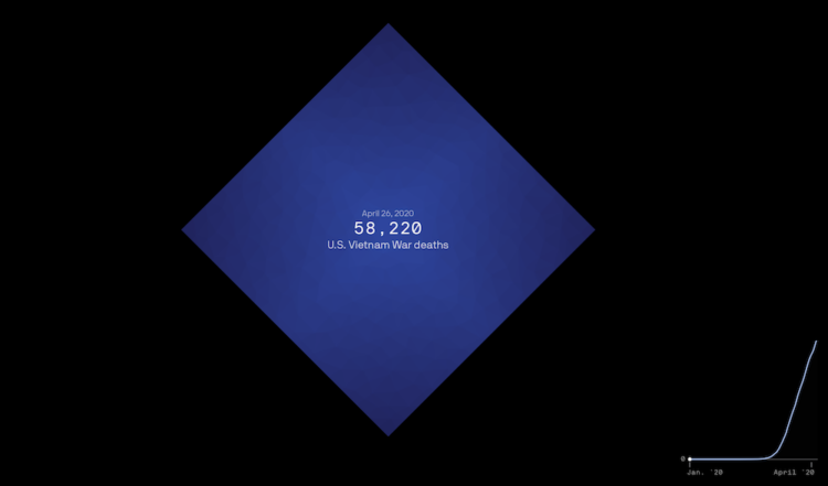
The United States is about to reach one million confirmed Covid deaths, or already passed the mark if you consider excess deaths. There’s no way to truly feel that number, but Axios visualized the scale, with comparisons against city populations and historical events.
A diamond shape represents counts, and as you scroll, shapes fill the screen until you only see the tips. The shapes overflow beyond what we can or want to understand. The time series line on the bottom shows cumulative deaths over time, leading towards the one-million mark.


 Visualize This: The FlowingData Guide to Design, Visualization, and Statistics (2nd Edition)
