Unemployment and Occupation

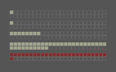
Unemployment is still higher than usual, and as you probably know, the shutdowns nationwide have affected industries differently. We could look at unemployment for just this year, but it’s more useful to see what the rate was for last year and compare it to this year. This gives us a baseline to compare against.

The data above comes from the Bureau of Labor Statistics.


Become a member. Support an independent site. Make great charts.

See What You Get

Favorites

Finding the New Age, for Your Age

You’ve probably heard the lines about how “40 is the new 30” or “30 is the new 20.” What is this based on? I tried to solve the problem using life expectancy data. Your age is the new age.

Real Chart Rules to Follow

There are rules—usually for specific chart types meant to be read in a specific way—that you shouldn’t break. When they are, everyone loses. This is that small handful.

How We Spend Our Money, a Breakdown

We know spending changes when you have more money. Here’s by how much.

The Best Data Visualization Projects of 2014

It’s always tough to pick my favorite visualization projects. Nevertheless, I gave it a go.