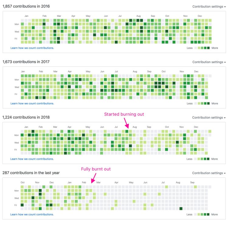
A quick annotation by Jonnie Hallman on Twitter: “GitHub is really good at visualizing burnout.”
GitHub contribution graph to show burnout
Second Edition
 Visualize This: The FlowingData Guide to Design, Visualization, and Statistics (2nd Edition)
 Visualize This: The FlowingData Guide to Design, Visualization, and Statistics (2nd Edition)
New tools, refined process.