Statistical graphics are often… kind of bland. But that’s fine, because they’re usually for analysis, and the wireframe does just fine. The time eventually comes though when you need to present your analytical visualization in a paper or some slides, and you’re no longer the primary reader.
In their NYT op-ed on health care calculations, Andrew Gelman, Nate Silver, and Daniel Lee had some graphics of their own that needed some NYT flavor and design treatment.
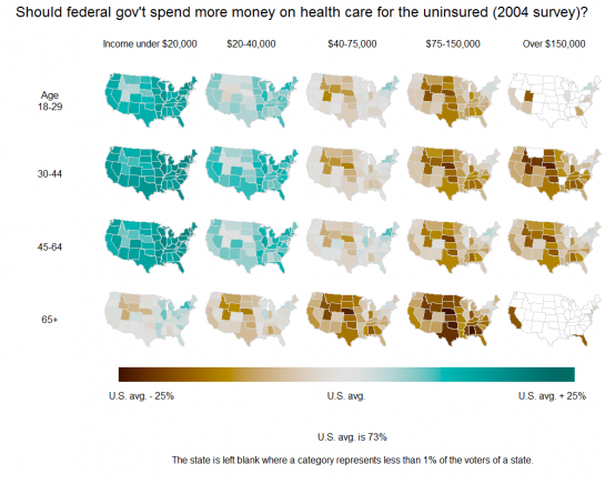
The above maps are a redesign of the original:

Notice the different color scheme, label changes, and some rearranging.
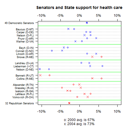
Then there was this original chart that shows senate and state support for health care:

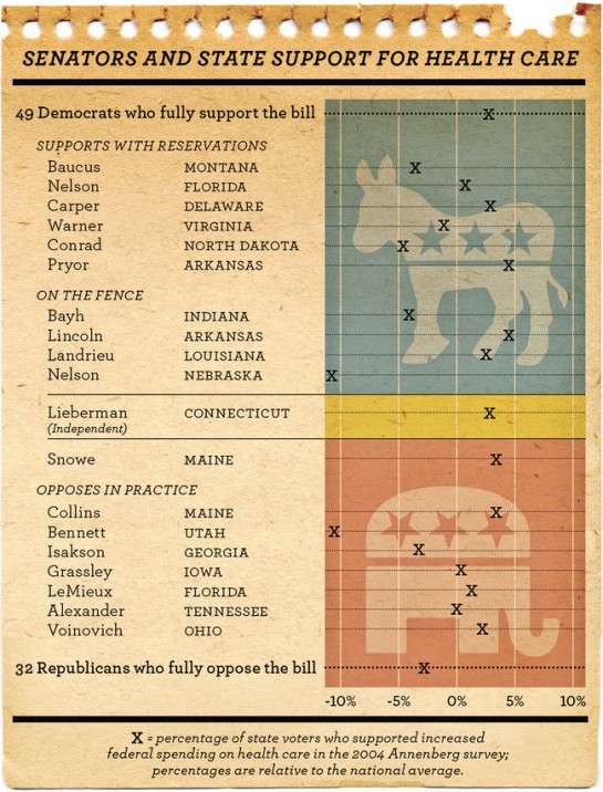
Here’s the redesign:

Instead of putting all the political parties on one chart, points are split by Republican, Democrat, and Independent. The redesign also only shows the 2004 numbers.
Not Just Prettified
Obviously the NYT versions look better, but it goes further than aesthetics. It’s about readability and adjusting graphics for an audience that’s not just you. As Andrew notes:
I liked our graphs, but the Times versions are better […]
It’s tougher to make graphs for a newspaper than for a book, scholarly journal, or even a blog, I think. Even beyond the different audiences, a newspaper graph really has to be self-contained. In a book or article I can accompany the graph with a caption, and I make full use of captions to make each graph reasonably self-contained (to the benefit of people such as myself who jump from graph to graph when reading), and in a blog I can put whatever I want right below the graph. But in the newspaper, the graph really has to stand alone and with minimal captioning.
And I think there in lies the difference between a visualization and an infographic.
Back to you – are the NYT redesigns an improvement?
[via Junk Charts]


Just like climategate the libs are manipulating charts again.
For the life of me I do not understand why anyone trusts these bozos running our country into the ground.
I hate to say it, but the Health Care Reform chart is by no means an improvement.
Who reads a legend sideways?
And the overly neon color scheme actually makes interpreting the pattern across categories harder, not easier (See Visual Explanations, Tufte, pg. 76-77).
Similarly, the overly bold background on the Senator redesign makes interpreting the pattern more difficult. As well, the alignment of the text with the Xs and the grid lines is worse off than the original.
These both qualify as over-designed chartjunk.
I think the second one is an improvement. It’s easier to understand the groupings and get a quick feel for public opinion.
I do not think the first one is an improvement. I just don’t like the new color scheme. It’s more of a qualitative theme. The original had it right with a diverging color theme. The graph is showing the divergence from a point (national average) in two different directions. The qualitative color theme the NYT graph uses places all the percentages on equal footing and, in my opinion, kills the point of the graph. It also confuses everything be saying that “darker colors represent less approval, lighter colors more.” But the darkest color is the national average and the color that represent 20% less approval than the average is a bright red. The color value of the red at one end and the green at the other seem to be the same to me. Maybe I’m reading this wrong.
Last thing, run the first graph through a red/green color blindness tester. Not sure how long this link will work:
http://vischeck.homeip.net/uploads/125985313810366/
-js
I don’t find any interesting data in the “Senators and State” report, but the maps are quite interesting. In particular, I find it intriguing and worth more investigation to determine why low class and poor people suddenly flip their stance from supportive of healthcare reform prior to retirement, to a stance of against healthcare reform after they retire (age 65).
Also interesting is that the country west of the Mississippi River, north of Texas, and the east side of the Rockies (except Colorado and the southwest) all tend to consistently be against healthcare reform. Those are the most rural states in the nation, still the most “pioneer” type states, and probably mostly agricultural still, and they are supposedly the types of people that the far left wing politicians are so often quick to point to as needing the government’s assistance, and yet, THEY DON’T SEEM TO WANT IT!
As for the aesthetics of the visual data, I do prefer the redesigned versions quite a bit. They are more “poppy”, and contain more visual interest than the originals, which makes them easier to gaze at for more than 5 seconds.
Pingback: Stat Charts Get a New York Times Redesign | FlowingData | World News
I’d say the redesigns are good. I like the visual style.
As noted above, Tufte (and many others) wouldn’t appreciate the bright colors on the maps, but overall they capture the data well. The main improvement I see here is the addition of more subtle color gradation. The original maps had too few colors to capture the full picture.
The only real issue I see with it is that the X mark indicates two different meanings in two contexts — it either indicates the majority of a political party (49 or 32 people), or it can indicate only a single person. This is confusing and could have been drawn better, probably by changing the size or glyph of the mark.
“The main improvement I see here is the addition of more subtle color gradation. The original maps had too few colors to capture the full picture.”
The reason that original used fewer shades is probably because nothing with +/- 5% of the original is meaningful or statistically different than the mean.
Also, perceptual studies have shown that our ability to detect the difference between more than about 7 shades is rather poor. So, adding more shades is not a good idea.
Good point. My perception originally was that there were color bins, something that always raises my suspicion because of gerrymandering effects. Since this is not actually the case in the original graphic, I’d have to say the NYT map offers little other improvement beyond eye-candy.
I think the NYT version of the senator comparison is improved primarily because of the grouping/labeling of the senators. With respect to the map on uninsured health care funding, I actually like how the the Gelman et al. maps have 0% associated with white. I think it helps focus one’s attention to states that deviate from the average that is not there with the NYT color gradient.
I agree. The NYT version of the uninsured health care funding is complete junk: vertical legend, abundance of colors, difficult to interpret, and so forth. In the original, the use of white for 0% really enhances the readability of the chart.
I think the new graphics look good, but are not as good.
Here are my thoughts
1. Nate/Gellman graph with white as neutral is better. I can see
the party politics patterns and electoral patterns clearly in Nate’s
and barely in yours. purple doesn’t look like 0. Patterns are lost.
This graph is like a painting of ‘negative space’ which for a graph I think is less effective.
2. By dropping 2000 year you are losing the thing graphed … movement. You could make it an arrow or some other thing
that shows movement… but dropping it loses the interesting
data.
3. Red/blue on top graph is I think a bad idea. Its certainly not a
neutral depiction of the data. Then again .. it does mesh roughly
with reality. When people say the average american wants x or y its clearly an overstatement. The county is polarized geographically in a way that matches party lines and Obama’s EC map. I think the Income and age relationships are huge, but they are lost with the biasing of the display in red/blue, IMO….
18-29 year old are that much more democratic I bet… its certainly muddled from using red/blue by comparision.
4. This dem / gop montage thing on the bottom graph is a mistake, IMO. It replaces a chart that showed movement on an issue and the current state on healthcare with a pure political horse race. So, I don’t think this adds to a dialog what it could. All I see is … “is polarization”. By pulling the Rs out into a separate area all you do is support that polarized view in which each side has a pre-determined view with minor deviations. Rather than legislators having a position on a spectrum reguardless on party. You are actually supporting polarizing here I think.
The graphics are nice… I want to see good graphs like these in magazines, more but I think the sacrifices here are more than they should have been.
thanks for your comment, garick.
just to be clear, the rework was by the new york times (not me :)
We knew…that’s why we so harsh. It’s the NYT.
Right, sorry about the sloppy post on my part. You just said nice positive things about the new graphics and I got carried away… :)
I love the site, btw.
Keep up the great work!
One important bit of quantitative data that is not highlighted enough, it seems to me, is the VERY HIGH value of the national average. Using the 2004 numbers, you have to go just about all the way to the “-25%” category before you actually find a population which is majority opposed (and this is only slight, because 73% – 25% = 48%)
Overwhelmingly, this survey shows voters IN FAVOR OF SPENDING MORE, as indicated by the fact that when you aggregate the demographics, the most opposed states show around -10% — which is still nearly 2/3 IN FAVOR.
Another thing to keep in mind: this was for an op-ed. The flavor is usually a little different from traditional NYT stuff.
Pingback: dougbelshaw.com/blog - Education, technology & tangential thinking.
Thanks a lot for this post. This is very informative article.I was wondering this stuff only.Thanks for such a great post.It is very useful for me.I would like to know more in this topic.Hope for know more in it.
Thanks.
Pingback: 自ç§:展示æƒå¨ « Ironic Paradox