Wealth distribution in America

Apr 16, 2013

This video clearly describes the distribution of wealth in America using a set of transitioning charts. The graphics are good. The explanation is better.

Become a member. Support an independent site. Get extra visualization goodness.

See What You Get

Favorites

Where People Run in Major Cities

There are many exercise apps that allow you to keep …

How the American Work Day Changed in 15 Years

The American Time Use Survey recently released results for 2018. That makes 15 years of data. What’s different? What’s the same?

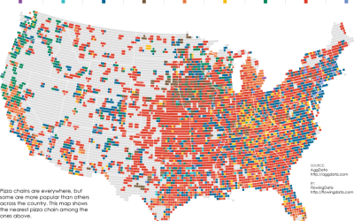
Pizza Place Geography

Most of the major pizza chains are within a 5-mile …

Years You Have Left to Live, Probably

The individual data points of life are much less predictable than the average. Here’s a simulation that shows you how much time is left on the clock.