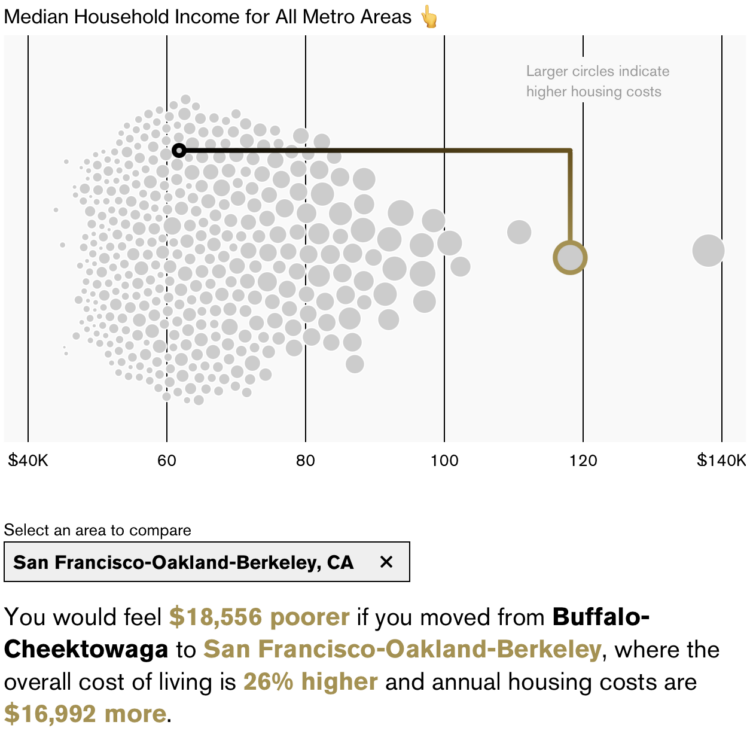
New to me, Bloomberg has an interactive by Claire Ballentine and Charlie Wells that lets you compare how income in one metro area would feel like in another due to differences in cost of living. For example, a $90,000 income in San Francisco, California is going to feel like a lot less than $90,000 in Buffalo, New York.
An interactive beeswarm chart shows the distribution of median household income for U.S. metro areas. Select where you live and select where you want to compare against.
My takeaway is that you should earn San Jose, California income while living in Brownsville, Texas, where the latter costs 21% less to live.


