How to Use a Slider to Let Readers Customize Charts
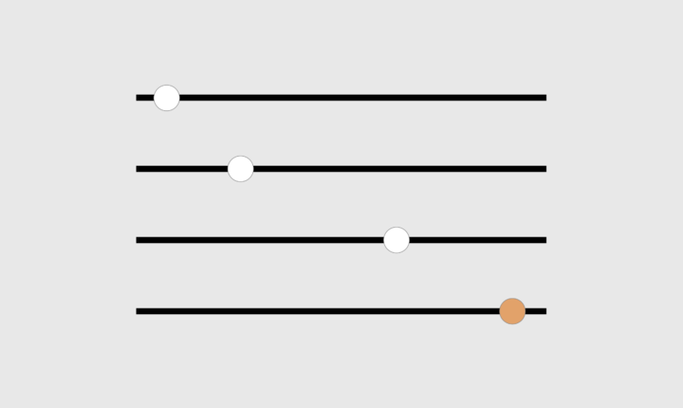
A simple user-controlled slider can help readers look at a dataset from their own point of view.

Sliders are good for letting readers relate more easily to the data. On mobile, they let you subset the data and show by parts instead of trying to squeeze everything into one view. Sliders are common in everyday online usage.
In this tutorial, you’ll learn how to include sliders with your charts.
To access this full tutorial, you must be a member. (If you are already a member, log in here.)
Get instant access to this tutorial and hundreds more, plus courses, guides, and additional resources.
Membership
You will get unlimited access to step-by-step visualization courses and tutorials for insight and presentation — all while supporting an independent site. Files and data are included so that you can more easily apply what you learn in your own work.
Learn to make great charts that are beautiful and useful.
Members also receive a weekly newsletter, The Process. Keep up-to-date on visualization tools, the rules, and the guidelines and how they all work together in practice.
See samples of everything you gain access to:


