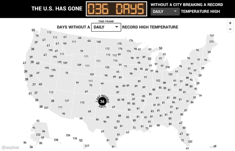
Here’s a fun/alarming weather map from The Pudding. Using data from the Applied Climate Information System, they show the number of days since a record-high temperature in hundreds of U.S. cities. The counters are in the style of those signs in factories that show days since the last injury.
Days since record-high temperatures
Second Edition
 Visualize This: The FlowingData Guide to Design, Visualization, and Statistics (2nd Edition)
 Visualize This: The FlowingData Guide to Design, Visualization, and Statistics (2nd Edition)
New tools, refined process.