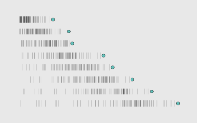
I scraped my inbox when I got a bunch of emails on Cyber Monday. It seemed like a lot, but I wondered by how much. It was about five times more than usual, which is a bigger shock to the system when volume a few days before on Thanksgiving was nearly zero.

Become a member. Support an independent site. Get extra visualization goodness.

See What You Get

Favorites

Who is Older and Younger than You

Here’s a chart to show you how long you have until you start to feel your age.

The Most Unisex Names in US History

Moving on from the most trendy names in US history, …

Visualizing the Uncertainty in Data

Data is an abstraction, and it’s impossible to encapsulate everything it represents in real life. So there is uncertainty. Here are ways to visualize the uncertainty.

Causes of Death

There are many ways to die. Cancer. Infection. Mental. External. This is how different groups of people died over the past 10 years, visualized by age.