How to Make Print-ready Graphics in R, with ggplot2
You don’t have to use illustration software to polish your graphics. If keeping everything in R is your thing, this tutorial is for you.
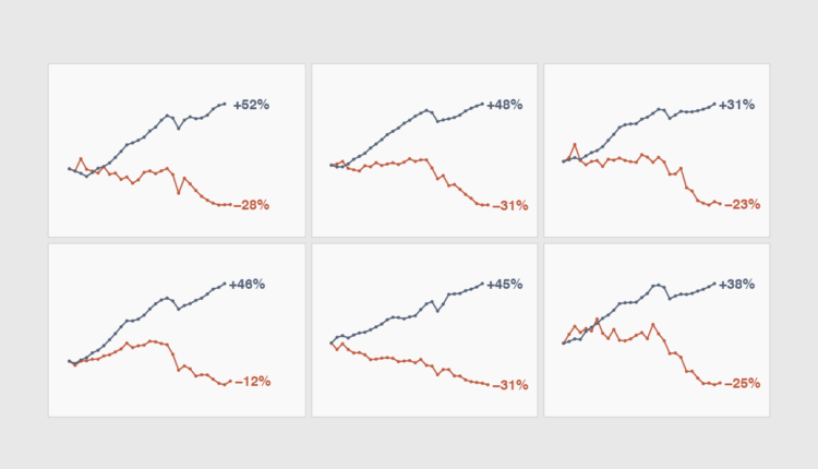
ggplot2 provides sensible default settings for analysis, but when you make charts for a publication, you often need to match an existing style and shift focus to readability over exploration. Design around a message or results instead of leaving interpretation open-ended. Finally, you need to export your charts in the required file format with the correct dimensions and resolution.
To access this full tutorial, you must be a member. (If you are already a member, log in here.)
Get instant access to this tutorial and hundreds more, plus courses, guides, and additional resources.
Membership
You will get unlimited access to step-by-step visualization courses and tutorials for insight and presentation — all while supporting an independent site. Files and data are included so that you can more easily apply what you learn in your own work.
Learn to make great charts that are beautiful and useful.
Members also receive a weekly newsletter, The Process. Keep up-to-date on visualization tools, the rules, and the guidelines and how they all work together in practice.
See samples of everything you gain access to:

