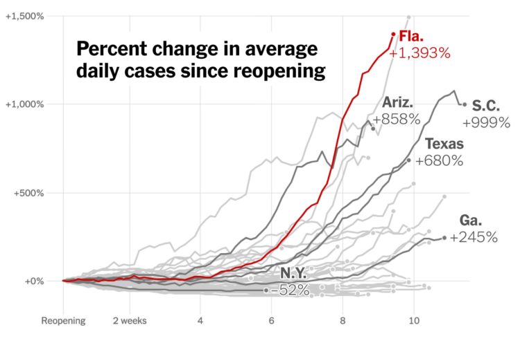
Using the now all too familiar baseline chart, where all of the time series line up relative to to starting point, The New York Times shows how case rates have fared since states reopened. Up, up, and away.
Increase in cases since states reopened


Using the now all too familiar baseline chart, where all of the time series line up relative to to starting point, The New York Times shows how case rates have fared since states reopened. Up, up, and away.