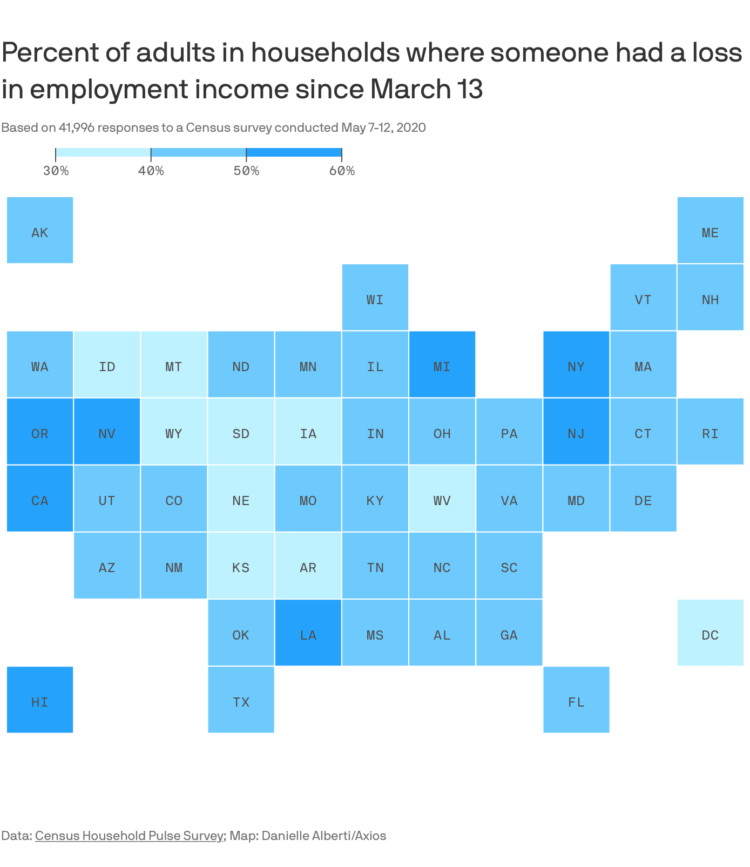
This straightforward grid map by Danielle Alberti for Axios shows the percentage of adults in a household where someone lost employment income. In all likelihood, you know someone affected in one way or another.
The data comes from the Census Household Pulse Survey, which is an effort to gauge the impact of Covid-19.


