Restless Sleep With Age
Every day that passes, I feel my age a little bit more. One of the relatively new things: it seems like no matter what I do, I cannot sleep through the night. I always wake up in the middle of the night for a mix of reasons. Maybe I need to go to the bathroom. Maybe one of the kids had a nightmare. Maybe I’m too cold or too hot. There’s always something.
Will it ever let up? According to the past five years of data from the American Time Use Survey, the answer is no. It will only get worse. Nice.
Sleeplessness Increases with Age
The struggle of staying asleep is real.
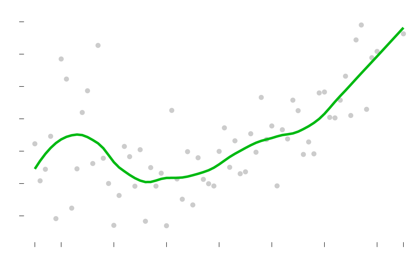
REPORTED SLEEPLESSNESS
10%
More sleeplessness? Yes, please.
9%
8%
During late teens and early 20s, sleep is iffy.
7%
6%
5%
Adulthood appears to kick in.
4%
16
20
30
40
50
60
70
80
85+
YEARS OLD
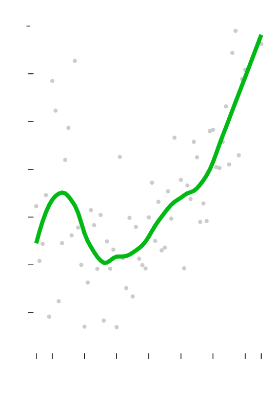
REPORTED SLEEPLESSNESS
10%
More sleeplessness? Yes, please.
9%
During late teens and early 20s, sleep is iffy.
8%
7%
6%
5%
Adulthood appears to kick in.
4%
16
30
40
50
60
70
85+
YEARS OLD
Between 2014 and 2018, about six percent of people age 16 or older said they experienced sleeplessness. However, when you break it down by age, you see more restless sleep during the teens and early 20s. I’m guessing this is related to irregular sleep patterns.
When adulthood kicks in, there’s more routine and maybe strong bladder control.
But the percentages only rise after 30. This is based on people who reported sleeplessness, so I suspect the percentages might be higher. Maybe it’s better to think of the percentages in terms of likelihoods. A 60-year-old is somewhere in the range of twice as likely to have restless sleep than a 30-year-old is.
You get a similar rising pattern when you look at sleeplessness percentages by time of day:
Rising Peaks of Restless Sleep
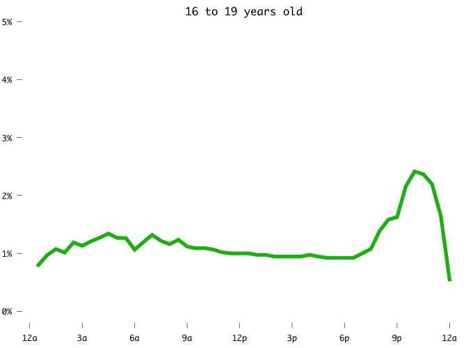
Something for you young ones to look forward to.
Notes
The data comes from the American Time Use Survey, 2014-2018, which is sponsored by the Bureau of Labor Statistics and conducted by the Census Bureau. I downloaded the data via IPUMS.
I made the charts in R. Here’s the tutorial for the animated line chart.
Become a member. Support an independent site. Make great charts.
See What You GetFlowingData is made possible by supporting members. Since 2007, I, Nathan Yau, a real person, have been analyzing and visualizing data to help more people understand and appreciate it in their everyday lives.
If you liked this or want to make similar data things, please consider supporting this small corner of the internet. You get unlimited access to visualization courses, tutorials, and extra resources. Thanks. — Nathan