The Stages of Relationships, Distributed
Some are quick to marry. Some take years or even decades to just start a relationship. And the process has changed over time. The animation below plays out the real timelines of Americans from the 1970s against those of the 2010s.
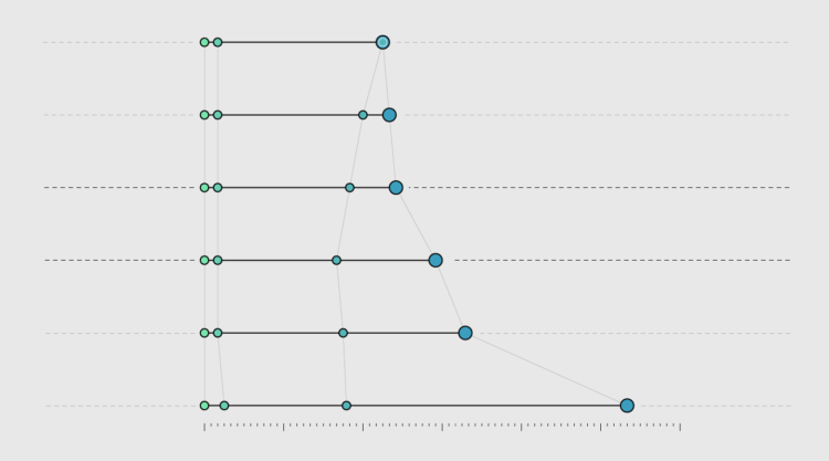
Time After First Meeting
Comparing the timelines of married couples from the 1970s and 2010s.
Based on data from the How Couples Meet and Stay Together survey, the chart shows that people typically wait longer to get married and live together sooner now than they did several decades ago. We saw this in the median timeline comparison.
However, in this view, you can better see the variation and extremes. You can see the people who married within the first few months after meeting. There are the people who married five decades after first meeting. I think there’s a romantic comedy script hidden somewhere in there.
The Relationship Timeline Continues to Stretch
Here are the timelines in aggregate, by decade.
Notes
- The data comes from the 2017 release of the How Couples Meet and Stay Together survey, administered by Michael J. Rosenfeld, Reuben J. Thomas, and Sonia Hausen.
- I used a weighted sample with replacement for each decade. There were 250 samples each.
- I analyzed and prepared the data in R.
- I made the chart with D3.js. Here is a relevant tutorial.
Become a member. Support an independent site. Make great charts.
See What You GetFlowingData is made possible by supporting members. Since 2007, I, Nathan Yau, a real person, have been analyzing and visualizing data to help more people understand and appreciate it in their everyday lives.
If you liked this or want to make similar data things, please consider supporting this small corner of the internet. You get unlimited access to visualization courses, tutorials, and extra resources. Thanks. — Nathan
Chart Type Used
