How to Make a Tiled Bar Chart with D3.js
Show individual data points by splitting bars into smaller cells.
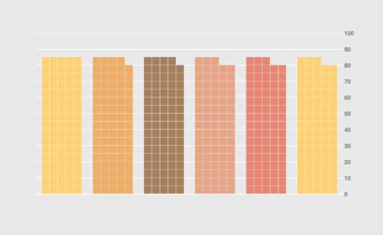
Bar charts are one of the most effective ways of conveying quantitative data, be it size of population, GDPs or life expectancy. However, while they’re excellent for comparing values, they don’t really convey the size of the values.
For example, if a bar is representing a population of 5 million people or of just a small group of people it’s still just a rectangle. There’s no indication (besides the y-axis) that a bar is representing 10, 100, 1000 or 10,000 individual items.
To address this, you can split a bar into smaller cells.
To access this full tutorial, you must be a member. (If you are already a member, log in here.)
Get instant access to this tutorial and hundreds more, plus courses, guides, and additional resources.
Membership
You will get unlimited access to step-by-step visualization courses and tutorials for insight and presentation — all while supporting an independent site. Files and data are included so that you can more easily apply what you learn in your own work.
Learn to make great charts that are beautiful and useful.
Members also receive a weekly newsletter, The Process. Keep up-to-date on visualization tools, the rules, and the guidelines and how they all work together in practice.
See samples of everything you gain access to:

