How to Make Better-Looking, More Readable Charts in R
Defaults are generalized settings to work with many datasets. This is fine for analysis, but data graphics for presentation benefit from context-specific design.
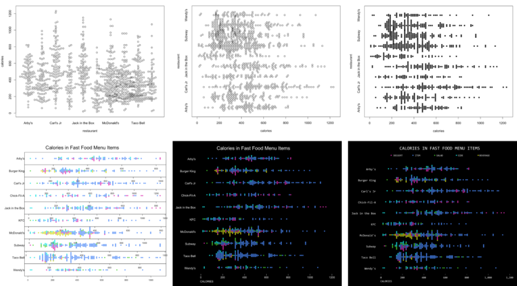
Charts generated in R often look like they came from R, because the easiest thing to do is to just to use default settings. However, just because you make the charts in R doesn’t mean they have to look that way.
My preferred method is to export charts as PDF files and edit in Adobe Illustrator, but this workflow isn’t for everyone. Sometimes it’s useful to keep everything in R.
This tutorial starts you with a default chart and changes parameters step-by-step to improve readability.
To access this full tutorial, you must be a member. (If you are already a member, log in here.)
Get instant access to this tutorial and hundreds more, plus courses, guides, and additional resources.
Membership
You will get unlimited access to step-by-step visualization courses and tutorials for insight and presentation — all while supporting an independent site. Files and data are included so that you can more easily apply what you learn in your own work.
Learn to make great charts that are beautiful and useful.
Members also receive a weekly newsletter, The Process. Keep up-to-date on visualization tools, the rules, and the guidelines and how they all work together in practice.
See samples of everything you gain access to:

