How Much Alcohol Americans Drink, in 2014
I enjoy my alcoholic beverages as much as the next person, but I drink for taste (or for data) and not so much for drunkenness. This of course is not the case for everyone. For some, beer, wine, and liquor needs to go down as fast as possible so that the night can get started already. Others are somewhere in between.
We can indirectly see how this varies across demographic groups by looking at how many alcoholic beverages people typically consume when they do drink.
Now, if only there were some data about this.
Oh wait, there is. The Behavioral Risk Factor Surveillance System (BRFSS), run mainly by the Centers for Disease Control and Prevention, surveys about 400,000 American adults each year across a variety of health topics.
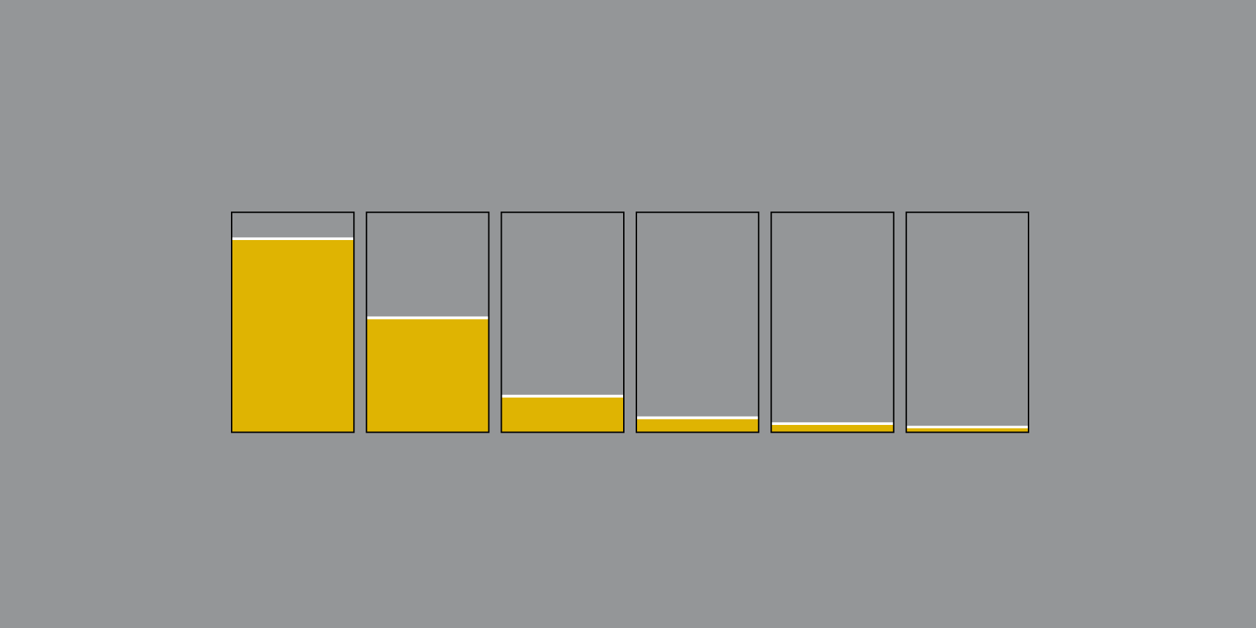
One of the questions about average alcohol consumption: “During the past 30 days, on the days when you drank, about how many drinks did you drink on the average?” In this case, a 12-ounce beer, a 5-ounce glass of wine, and a shot of liquor are each considered a drink. Here is how people answered in 2014.
As expected, men typically drink more than women. Of the groups shown, the most frequent answer was one drink on average.
However, for Hispanic men, two drinks was slightly more common than one and the distribution skewed towards higher counts. It’s a similar case for Native American men.
And it’s in those higher counts where it gets interesting. Consuming ten or more drinks on average seems like a lot, doesn’t it?
Nerd Notes
Become a member. Support an independent site. Get extra visualization goodness.
See What You Get

