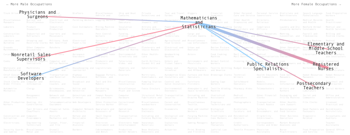
People with certain professions tend to marry others with a given profession. Adam Pearce and Dorothy Gambrell for Bloomberg Business were curious.
When it comes to falling in love, it’s not just fate that brings people together—sometimes it’s their jobs. We scanned data from the U.S. Census Bureau’s 2014 American Community Survey—which covers 3.5 million households—to find out how people are pairing up.
You get a matrix of professions organized by more male to more female, left to right. Mouse over any profession or use the search box and lines project out to the five most common professions that the one of focus tends to marry to. The pink and blue color gradients indicate the sexes of the two spouses.
So for each profession, you get a quick view of who people marry, whether it be outside their own or within. I like how when you mouse over the far left or the far right, you see lines jut across to the opposite side. I wonder what the tendencies are in total for male-dominant to marry female-dominant professions and vice versa.


