Causes of Death

There are many ways to die. Cancer. Infection. Mental. External. The Centers for Disease Control and Prevention classifies the ways into 113 causes, which are grouped into 20 categories of disease and external causes. The CDC’s Underlying Cause of Death database provides estimates for the number of people who die due to each of the causes.
As you’d expect, some causes of death are more common than others. For example, about a third of people die from diseases of the respiratory system (like the flu), but less than three percent die from infectious or parasitic diseases (like Tuberculosis).
Then take age into account. It’s much more likely for older people to get cancer than it is for younger people.
Finally, look at cause across different groups of people and you see different distributions.
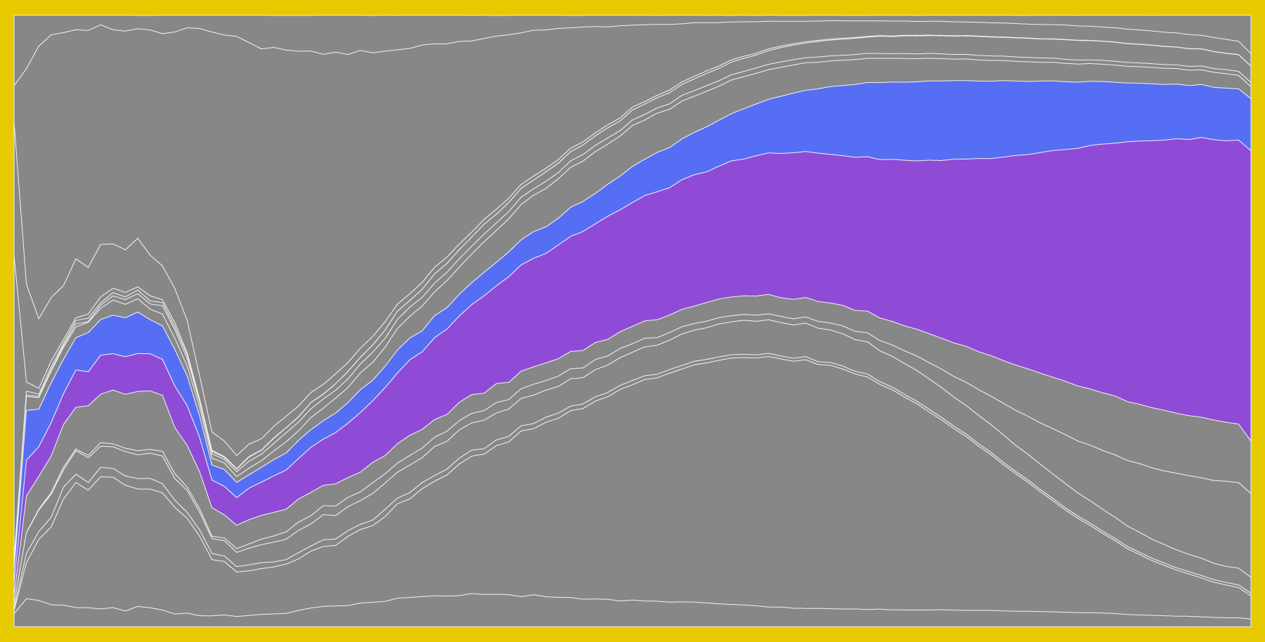
The chart below shows how cause of death varies across sex and race, based on mortality data from 2005 through 2014. Select a group to see the changes. Select causes to see them individually.
The height of any strip in the chart represents the percentage of people who died of a cause out of those who died at that age. For example, of the females who died at age 60, about 40 percent of them died from cancer.
When you select races, you might notice that the smaller groups, American Indian and Asian, appear to be more jagged, whereas cause of death for the larger groups, black and white, appear to be smoother. This is likely due to population size more than anything else. It’s a smaller sample, and there’s higher variance.
So focus on the overall trends and how they change by group.
For example, compare cause of death for female versus male, and you see a big difference for external causes. For females, it accounts for about 5 percent of deaths. It’s twice as common for males, and mostly at a young age pre-40s.
Keep in mind that this shows percentages and not absolute counts. So while the percentage for cancer decreases with age, it doesn’t necessarily mean that people grow impervious. It’s much more likely that with age comes higher susceptibility to other diseases.
 How You Will Die
That’s how people die at various ages. Now here’s a simulation to see how this applies to you.
Nerd Notes
- The chart above is a stacked area graph inspired by the now-classic charts from the New York Times on time usage and from Martin Wattenberg on baby names.
- I used 2005-2014 data for a more up-to-date view, but the CDC provides data that goes back to 1999. If I had gone back farther, the areas for American Indian and Asian would probably be smoother.
- I thought about filters for sex and race at the same time, so that you could compare say, black female versus black male. But I liked the simplicity of one filter at a time better.
- The interactive was made with d3.js. Data processing and analysis was in R, which is the main language I think in statistically.
Become a member. Support an independent site. Make great charts.
See What You GetFlowingData is made possible by supporting members. Since 2007, I, Nathan Yau, a real person, have been analyzing and visualizing data to help more people understand and appreciate it in their everyday lives.
If you liked this or want to make similar data things, please consider supporting this small corner of the internet. You get unlimited access to visualization courses, tutorials, and extra resources. Thanks. — Nathan


