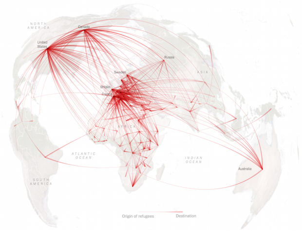
According to estimates recently released by the United Nations, about 14 million left their home countries because of conflict or persecution. Sergio Pecanha and Tim Wallace for the New York Times mapped the migrations.
After the data, there are two things that make this series of maps. The first is the projection, azimuthal equidistant, centered on areas where there is the most activity.
The second is the use of line thickness to indicate the direction that people migrated, from one country to another. Usually these migration maps use single-width lines accompanied by symbols or colors. This subtle growth from thin to thick provide clarity to one could easily be a mess of lines.


