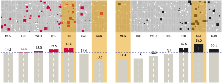
As we’ve seen, there are more fatal car crashes during the weekend and summer months, which is some time between May and September in the United States. The Guardian took a different approach to look at road fatalities in Australia.
The bottom section is your standard bar charts that show an average, but on top are mini-simulations that represent the averages. Small cars move in the background and squares appear on top to at different volumes. I originally thought the cars actually collided with each square, but it looks like they’re independent of each other. Nevertheless, an interesting approach.


