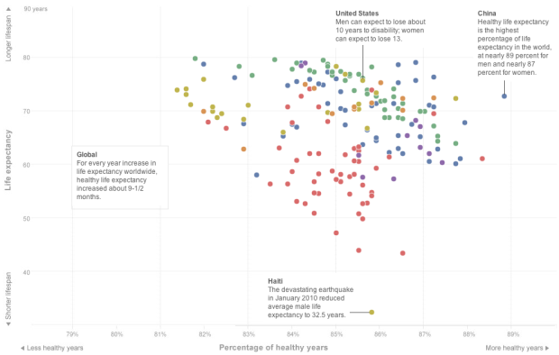
Bonnie Berkowitz, Emily Chow and Todd Lindeman for the Washington Post plotted life expectancy against percentage of healthy years. Although life expectancy is increasing, the percentage of years living without disease isn’t quite keeping up.
People are living longer lives, but the time they are gaining isn’t entirely time with good health. For every year of life expectancy added since 1990, about 9 1/2 months is time in good health. The rest is time in a diminished state — in pain, immobility, mental incapacity or medical support such as dialysis. For people who survive to age 50, the added time is “discounted” even further. For every added year they get, only seven months are healthy.
On the other hand, total number of expected years in good health is still on the plus-side, and I think most people would choose years in poor health over fewer years. So it’s not all bad news.


“More years of disease,” with longer lifespans, often is referred to as “expansion of morbidity” in public health terms, FYI.
I don’t get why the % has been used for the X Axis. It is completely misleading, in partiulcar considering that the X scale is very tight.
For example, US do better than China in terms of numbers of healthy years, and the graph clearly shows the opposite.
i really wish Hans Rosling could see (and use…) this data.
I agree