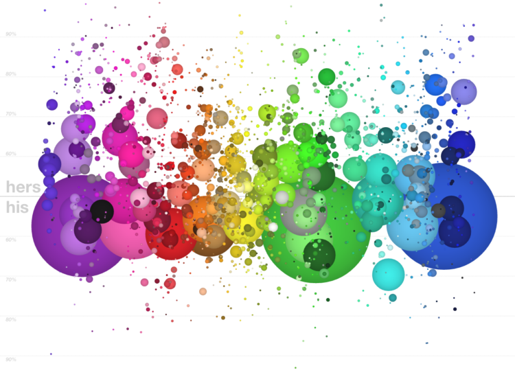
A couple of years ago, xkcd ran a survey that asked people to name colors. Stephen Von Worley plotted that data by gender in an interactive.
That’s a dot for each of the 2,000 most commonly-used color names as harvested from the 5,000,000-plus-sample results of XKCD’s color survey, sized by relative usage and positioned side-to-side by average hue and vertically by gender preference. Women tend to use color names nearer the top, men towards the bottom, and the dashed line represents the 50-50 split (equal usage by both sexes).
While his original version was static, the interactive version lets you sort by hue, saturation, brightness, popularity, and name length. Most importantly, you can see the color names now when you mouse over. I like the vertical spectrum of purple, where women use names like bright lilac, orchid, and heather, and men tend to label similar shades as purplish, lightish purple, and oh yes, very light purple. [Thanks, Stephen]


lol women’s are like honeydew, sage, asparagus green…the male’s is literally “baby shit green”
this is pretty meaningless when it comes to anything but proving a learned cultural difference…. simply using a more specific name for a color doesnt prove anything about accuracy of recognition. what it does prove is that through nail polish, makeup, scrapbook/arts and crafts women tend to encounter these diff color names more often then men so it makes perfect sense that the number show up like that. almost all are tints/shades of a base color so sticking with/saying purple when your environment hasn’t exposed you to orchid or plum makes much more sense
That’s sort of the point..
if you had mentioned that point in the article it would have been the point. the way it is presented tends to aim more at highlighting differences between us with out giving a cause. Whats worse is people who are un aware of biological determination propaganda tend to take studies like amy presented as the whole truth. Most of the time pop media/news is trying to point out that there are biological differences but when you look into it scientists say personality and reasoning differs more person to person than by gender and the small inate differences that exist can be balanced out with proper education (but we do the opposition).
the article that amy cited below doesnt take into account that 30-40% of either gender receive more or the opposite hormone than they are supposed to(prenatally ). notice that they fail to provide real numbers about how many were tested and how many actually came up the way they expected. this is an example of oversimplification of science
I’m probably being a bit thick here, but how can the basic colours like “black” not be 50/50? Is this saying that of all the people who use the word “black” to describe the colour black, 54% are male? Either the sample responses were not 50/50 male/female, or there are females who have a different word for that colour.
What am I missing??
why would you use other names for a color than it’s own name?
http://www.squidoo.com/flower-arranging-courses
Who determines each colour’s “own name” then?
Isn’t that the point of the exercise? What you call “fuschia” I call “pink”.
I love this. It takes something that at first seems inanely trivial, and invites you to think about it more deeply in a way that looks stylish and raises a smile. Big win.
This was a great exercise from XKCD, and this is an excellent visualization of the resulting data.
You may be interested to read this : The eyes have it: men do see things differently to women (http://www.alphagalileo.org/ViewItem.aspx?ItemId=123616&CultureCode=en).
if you look at Dr. John T Manning’s 2D 4D digit ratio theory you can see there is evidence to suggest that not all males or females receive the prenatal hormone doeses our cultural assumptions expect them to. It is 30-40%…these people are not automatically gay or trans…they are not even abnormal because 40% is a pretty big number… What i am getting at is studies like this that dont give actual numbers for their results and assume every male brain and female brain got the expected hormone exposure…Are not to be taken as true science.
Reminds me of a scene from an old Simpsons episode where Lisa goes to a Kinkos-type store:
Lisa: Okay, I’d like 25 copies in canary, 25 in goldenrod, 25 in saffron, and 25 in paella.
Clerk: OK, 100 yellow.
Anyone notice that when sorted by hue there’s the “constellation of bodily functions” right below yellow. It’s a small concentrated area of “baby puke”, “vomit”, and “crap” (among a host of others).
More seriously, I’m really impressed by how the difference between sorting by hue and sorting by popularity really changes the view of the data. By popularity you can see the trend moving up and to the right; showing that women gave more diverse names. This is a great visualization!
While the graph is pretty, I could not draw any conclusions from it as it is just all over the place and too hard to interpret. There are bubbles of equal size and color high and low. The teeny bubbles detract from the true trends. I could go on. Useless.