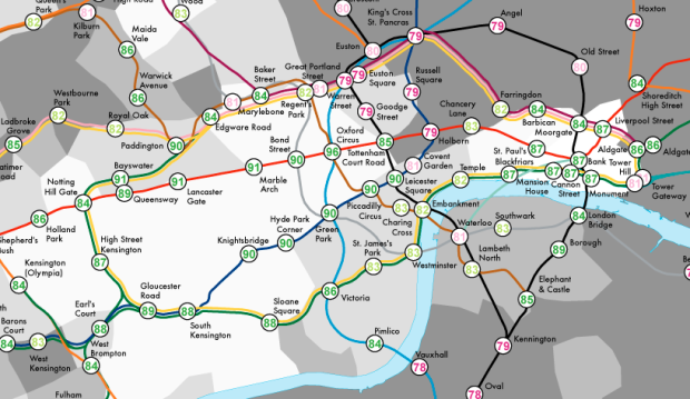
Geographers James Cheshire and Oliver O’Brien visualized life expectancy in London as a tube map.
Whilst the average life expectancy predictions show that today’s children are expected to live longer, the range is startling. For the stations mapped, it is over 20 years with those around Star Lane (on the DLR) predicted to live, on average, for 75.3 years in contrast to 96.38 years for those around Oxford Circus. The smaller disparities are no less striking. For example, between Lancaster Gate and Mile End (20 minutes on the Central line) life expectancy decreases by 12 years and crossing the Thames between Pimlico and Vauxhall sees life expectancy drop by 6 years. The stations serving the Olympic Park fair badly and contrast with the Olympic volleyball venue at Earl’s Court whose spectators will be passing through areas with far higher life expectancies and lower child poverty
The tube map metaphor is typically a stretch, in line with the periodic table of whatever, but this actually works. [via Guardian]


Cool. The title needs to be fixed though :)
Oof. Thanks.
I don’t think that the tube-map metaphor goes too far, but in fact that they didn’t go far enough. Many people’s geographical concept of London is based around the tube, but it is based on the standard abstract tube map rather than how it actuall plays out above ground. I think I would have enjoyed it more overlayed on this: http://www.tfl.gov.uk/assets/downloads/standard-tube-map.pdf