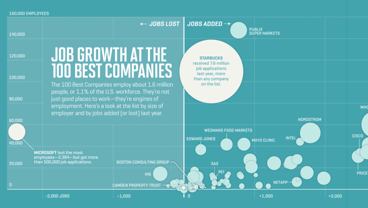
Nicolas Rapp and Anne Vandermey with a straightforward look at new jobs added at the top 100 companies to work for, according to Fortune.
Fat paychecks, sweet perks, fun colleagues, and over 70,000 jobs ready to be filled — these employers offer dream workplaces. Like Google, which reclaims the top spot this year to become a three-time champion. Meet this year’s top 100, network with the winners on LinkedIn, and more.
Number of new jobs added or lost is on the horizontal, and number of employees at the start of the year on the vertical. Bubble size represents number of job applicants.
There were 7.6 million applicants to Starbucks last year. That’s insane.


A nice, clear 3-dimensional presentation. One flaw: there is no indication where the data point for the bubbles is. I assume it’s the center of the bubbles. There is no cited data from the vertical axis to even guess, and the job applicants diagram visually suggests it’s the base of the circle that is our reference point.
It seems like this should be visualized in terms of percentages, not raw numbers. A company with 5,000 employees that adds 500 new positions (=10% growth) is growing faster than Starbucks, which also adds 500 new positions but has 110,000 employees (< 0.5% growth).
I agree percentage of growth would be a lot better. Also being interactive would be helpful as so few of the “bubbles” are actually labelled.
How about coloring the bubble by industry?
Starbucks only grew by like 500 employees, but took in 7.6 million applicants?
Also, I think the axes should be flipped. The number of employees is the independent variable. The response variable is growth, which should be plotted on the vertical axis.
Nice comparison chart. Including the number of applicants is a nice addition to the usual growth/loss information.
“There were 7.6 million applicants to Starbucks last year. That’s insane.”
That probably only comes out to about three per store. ;-)
>> That probably only comes out to about three per store
Ha, good point.