To encourage the integration of broadband and information technology into local economies, the National Telecommunications and Information Administration (with some help from Stamen) now provides an exploratory tool for broadband in your community:
The National Broadband Map (NBM) is a searchable and interactive website that allows users to view broadband availability across every neighborhood in the United States. The NBM was created by the National Telecommunications and Information Administration (NTIA), in collaboration with the Federal Communications Commission (FCC), and in partnership with 50 states, five territories and the District of Columbia. The NBM is a project of NTIA’s State Broadband Initiative. The NBM will be updated approximately every six months and was first published on February 17, 2011.
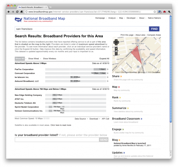
There’s a lot of data to look at, but you can search for the city or zipcode that you’re interested in, and get information on what’s available, as shown below. You can also see how your city compares to other locations in the country.

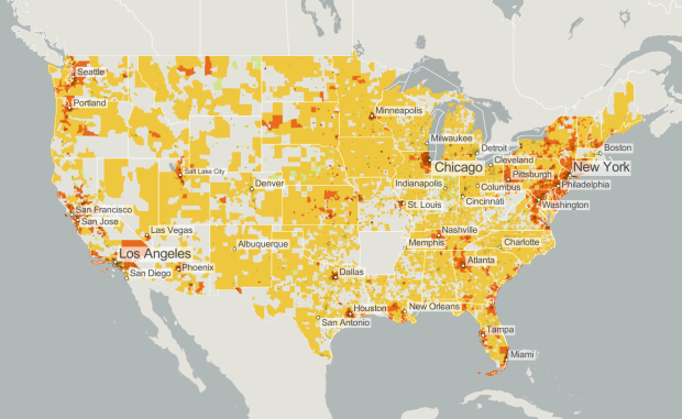
The highlight is the gallery of maps (click on “Show Gallery” on the bottom). The above map, for example, shows population density and average broadband speed. There are three color scales for broadband ranges. Green is low, yellow is medium, and red is fastest. Then the darker the shades within those color scales are, the greater the population density is.
The site is still kind of clunky, partially because they seem to be getting hit hard with traffic right now, but this is leaps and bounds better than most government sites. It’s easier to navigate, provides a lot of information, and lets you explore what you want relatively quickly. Your turn, Census Bureau.
Update: By the way, there’s also a developer section, but it blanks out on me when I load it. Looking at the source, it seems there are some APIs available, but I really don’t want to read documentation via source code right now.
[National Broadband Map via @stamen]


Wow, that website is stunningly broken for me, for some reason (FF, Chrome, Safari, no go.). Too bad, it looks interesting.
It’s not handling the traffic well at all right now. Tomorrow will probably be much better.
Who says America doesn’t do irony?
Wow, Arkansas.
Still, I think “how connected your community is” is a misleading headline. When I think connected communities, I think of people who go to church and the Friars Club ever week, not using the internet. Maybe “how online your community is?”
But it’s a broadband map. That suggests online to me.
yeah, but what about Arkansas. The little voice in my head says to check for a data glitch. Can you confirm? thanks
Seriously.
I live in Arkansas, and the internet exists here…but even though we pay for “high speed” cable internet, we have HORRIBLE speed test results consistently (thanks Cox Communications!). I can’t imagine our entire state is completely out of the stats, but considering our crappy providers, maybe. I’m leaning towards glitch too, though.
@JessicaC – I don’t believe you. I know you’re on dial-up :).
JessicaC–can I get someone from Cox Communications to take a look at your service? You shouldn’t be experiencing such frustration with your speeds, and I am happy to have someone investigate what the root cause might be so we can resolve it. Feel free to message me at [email protected]. Thanks–and my apologies for your dissatisfaction!
What’s up with western MA?