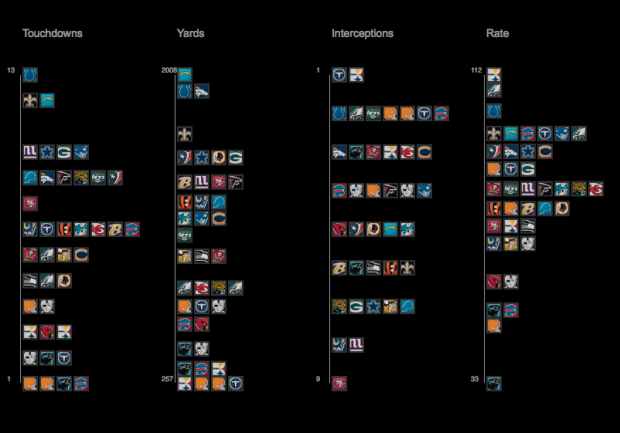
Sports statistics. Always so many tables. Juice Analytics takes a more visual approach with their interactive:
Our NFL stats “spike chart” is an easy way to see who’s leading the league in passing, rushing, receiving, tackles, team offense, and team defense. By showing key metrics side by side, you get the full picture of a player or team performance—not just the highlights.
It’s pretty straightforward. Select a category on the top, such as passing or rushing, and then see how your favorite players rank in four subcategories. Each player is represented by his team logo. Roll over a logo to see a player’s numbers as well as how they rank in all the subcategories, highlighted by a white square.
Finally, use the search box to find the player of interest. Matching boxes highlight as you type.
Such a simple idea. Well executed.


Odd that the interceptions column goes from low to high, while all the others are ordered high to low… visually this is deceiving as at first glance it appears that the top two quarterbacks have the fewest interceptions, when actually the opposite is true.
This seems to be the only place the scales are reversed. I love the way you can visualize stats in context of one another though!
I think it’s meant to be read as best to worst instead of highest to lowest.