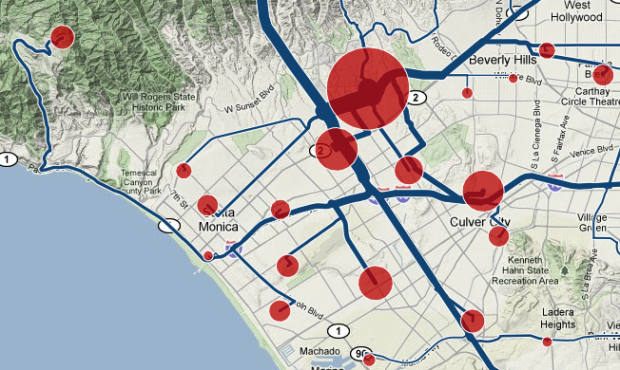
Some people live in areas where a one-hour commute both ways is common, while others practically live across the street from their workplaces. Engineer slash designer Harry Kao has an interactive look at commuting by zip code:
In Traffic: Why We Drive the Way We Do (and What It Says About Us), the author states that commute times throughout history have remained steady at roughly a half hour in each direction. Advances in transportation technology (our feet, horses, bicycles, trains, automobiles, flying cars, etc.) allow us to live farther from where we work. This got me thinking about my own commute from Berkeley to San Francisco, how it compares to those of my neighbors, and how commutes vary across the country.
Using commute data from Census Transportation Planning Package and travel times from the Google Maps API, an interactive map lets you see where people in your area commute to or from. Enter your zip code and explore.
Red dots are sized by number of commuters go in and out of the zip code area, and blue trails indicate direction. The above, for example, is the view of people from all over commuting to UCLA.
One drawback is that the commuter data from now defunct CTPP is from 2000, so it’s not completely up-to-date, especially in the rapidly developing areas, but it will give you a pretty good idea. The map should be particularly useful to those (like me) considering a job or a move to somewhere with commute times.
[Commute Map | Thanks, Harry]


I regret the last 10 years of my life for not knowing that commuting data existed at this level of detail. But the future is now brighter thanks to this post.
This map is a nice presentation of interesting data. The Google point-to-point routing doesn’t really make sense for zip codes, but it gives a good visual sense of flow.
Pingback: The Commute Map | The Brooks Review
This might not work very well in the suburbs or where the zip code geo-centroid is not near the center of the population. My 12 minute, 4 mile commute is estimated at 38 minutes and 15 miles to the adjacent zip code.
I really like the option to change to a blank background, but satellite makes the lines most visible.
When bringing up a tool-top for a red dot, median may be more useful than average, or an average that excludes the outliers, because for the few zips that I checked, got results like:
The average commute from zip is 21.9 mi and takes 28 mins, and 85.7% of commuters travel 28 mins or less.
Apparently, in the data, people commute from the east coast to the west coast, and if they do that, I doubt they are driving their cars.
I am thankful the developers included the bar charts, or I would not have easily see this.
I would have to dig through the boxes in the garage to get you a cite, but it was the same in the 50s–whether you lived in what was then an Eastern industrial city or a sprouting California suburb, whether you commuted by surface streets or freeway, the average commute was just under 30 minutes. It must be a programmed constant.
But averages don’t tell the whole story. Some people commute vast distances. I agree with Joe Mako, that a median would help and even better would be Tukey’s 5 numbers.
Pingback: Daily Links for September 13th through September 14th | Akkam's Razor
Pingback: FREEwilliamsburg » Fun with Maps! Everybody who lives here works here also.
Pingback: A few things I need to tell you about « smörgåsbord
Pingback: Commute map: 02134 : allston city limits
Pingback: TomTom directing drivers to shorter travel times « smörgåsbord