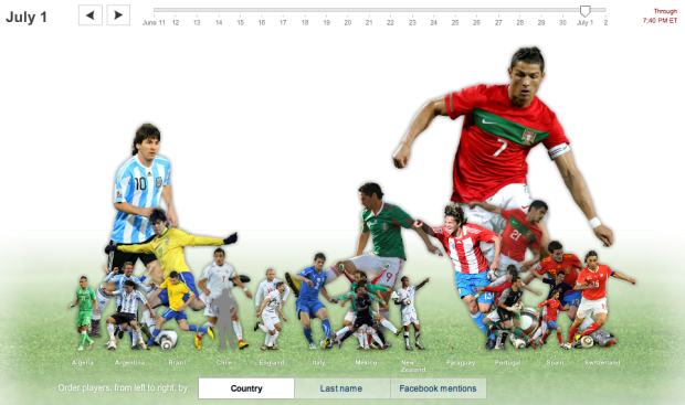
I always know when something exciting happens in the World Cup when my Facebook stream is flooded with announcements of a goooooooaaaal. On any given day, certain players are more talked about than others. The New York Times explores the day-to-day fluctuations of player mentions in Facebook status updates.
I wish they had tried to go by area somehow, like I wanted last week, but the interaction is slick, and it’s just plain amusing watching players shrink and grow as your scroll through time.
The timeline lets you select the days, and the tabs on the bottom let you choose how you want to sort the players. Scroll over any player to see a time series for the day.
As usual, great work by Shan Carter, Ben Koski, and Kevin Quealy.
Now where’d my vuvuzela go…


Another reason for all of you who participate in the opinion data mine that is Facebook to consider your choices.
Anyway, visualization 101: is it the height or the area of the player that is indicative of the variable they’re trying to convey?