GOOD magazine’s most recent transparency contest asked designers to focus their powers on showing CEO compensation in the United States.
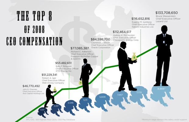
The above graphic, by Dee Adams, won top honors. Adams’ graphic shows the eight CEOs with the highest compensations and the number of minimum wage earners that each respective CEO’s compensation could have supported. Bruce Wasserstein of Lazard ltd. was the top earner at $133 million, or the annual salary of 8,866 minimum wage earners.
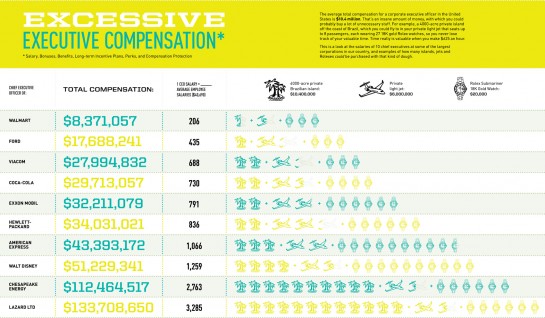
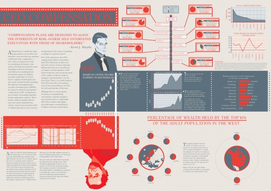
Below are the two runners up by Amanda Buck and Thomas Edwards, respectively.
Whether these salaries are justified, well, I’ll leave that up to you to decide.
Check out all the other entries here.


Some great visual work there. I do have an issue with the assumed notion that the salaries are excessive or are only earned on the backs of ordinary workers (a notion made explicit in the winning visualization). Whether or not pay is excessive is a question best answered relationally (i.e. firm performance, earnings, workforce growth, pay relative to peer CEOs and firms, etc). It is a debate that we need to have, but the entries didn’t really seem to attempt such a relational analysis (some touch on it, but the thrust to me seemed to be to focus on “outrageous” compensation). Just a thought.
@Bill – yeah, i think you’re right. that’s what i was getting at too. the winning graphic, for instance, implies that the CEO is stomping over the little guy, but he might be responsible for the jobs of thousands. So I don’t think that just because these CEOs are making millions means they’re overpaid. I think most of us don’t know what it’s like to run a company at that scale.
CEOs may indeed work hard, but they certainly don’t work ten times harder than the average worker, much less hundreds of times harder.
it’s not so much about amount of work (although that matters) than the type of work. Someone at a fast food joint can work just as hard or more hours than a doctor, but you’re not going to give them the same wage.
I think it’s disingenuous to claim that the CEO’s salary is justified by the number of jobs “he” created. CEOs are responsible for making difficult decisions and understanding business logic, but in practice ideas are only as good as their implementations, which depend on the efforts of plenty of people besides the CEO, from his second in command all the way down to the minimum wage grunts on the front lines.
In reality, everybody within a company is mutually dependent on the performance of everyone else, though the magnitudes of those dependencies may vary, and so no single employee owes his job solely to the efforts of the CEO.
Interesting that the winner, although clearly the cleanest graphic, was also the most politically (small p) charged. The bottom graphic seems to be the most informative: comparing pay to performance, showing poverty rates and minimum wage; but probably offers too much information without drawing clear connections between it. I’m also not too keen on the image of the “top earner” as clean-cut tie-wearer and the “bottom earner” as shaggy-haired hobo.
I hadn’t heard of Lazard Ltd or Bruce Wasserstein, the top CEO in the winning graphic. When I went to Google him, I quickly found out that he died about a week ago.
@Nick: you are assuming value is simply defined by raw effort. There are more inputs that you need to consider.
This is a great idea for a contest, but these are missing the mark for me. The top one may appear less busy than the bottom two, but how am I supposed to compare the men? If they were all copies of the same silhouette, not great but ok and in context of the rest pretty good. Unfortunately they are all in different positions and are obviously different people. So how am I supposed to compare? The numbers? I have to look to find them.
I do like the way to designer of #1 decided to take the politics and run with it. Just wish they had put more thought into how the viewer interprets the data in the chart.
I went back and read the details of the contest and it was actually sponsored by Michael Moore’s new movie so I think the goal of these particular infographics was to be inflammatory. Hence I now see why the winner’s was chosen as such.
Pingback: A week of digital life October 21st | The Juicy Cow
No human should have the right to make that much more money than the average wage earner.
The top graphic is very accurate: The rich have always relied on poor workers to provide everything they need. They used to claim they were gods; now, they claim that their leadership qualities justify their inflated earnings. But studies have shown that, like the rest of us, their success can mainly be chalked up to sheer luck. Don’t be fooled again, people.
The first compares CEO compensation with minimum wage, the second compares it with average salary. I would have liked to have seen it compared to the average income of those employed by their company.
The third place entry had an interesting idea of comparing it to the stock performance of the company, but didn’t implement it very well, and apparently this info wasn’t available for all of the entries. (It also has a broken border around Frederic M. Poses’ performance table.)
Seriously? Do you think the “Average” CEO gets paid this much?? This graphic is skewed thanks to the AFL-CIO. Talk to a CEO of a local business in your town, see what his/her response is..
So why is it OK if an NBA or NFL star makes 30 Million a year? Steve Jobs is just as important to Apple as Labron is to the Cav’s… Let them earn what the market bears… That is why they went to college and have excelled in the business world.
@Brad: Is it ok that a sports star makes millions? For playing a GAME? I don’t agree at all.
As for CEOs making or breaking a company, most of the time it is sheer luck, not talent or personality, that determines success. (Though Jobs may be one of the exceptions here.) There’s a lot of studies out there that back this statement up.
@tristan – Who cares if it is a game, business, whatever – all comes down to revenue. If you are responsible for creating/generating revenue, you should be paid accordingly.
Completely disagree with you as far as luck and CEO quality. I have worked with outstanding CEO’s an horrible CEO’s. It is their leadership, personality, and understanding of the business model that typically dictates the success of the organization.
Did anybody notice that the bar chart in the middle right hand side of the third one is horked? As you rise from the bottom, the bars get bigger from “Consumer Services” (4367.6) through “Utilities,” Basic Materials,” and “Industrials” (5638.8, 6552.2, 7121.0), then they _shrink down_ as you go to “Financials” (7604.5) and then grow again through “Oil & Gas,” “Consumer Goods,” “Technology,” and “Health Care” (8167.5, 8725.7, 8827.2, 12446.6) but even the last bar representing 12446.6 isn’t as big as the bar representing 7121.0.
@W – good catch. definitely some messed up labeling going on there.