We spend so much time trying to make our graphs accurate, simple, understandable, etc that we forget the lost art of making graphs that are inaccurate, unreadable, make absolutely no sense, and make your eyes want to vomit. I’m so tired of understanding data. I want to experience it, and I know you want to also.
So this one’s for you, crappy graph.
We’ll start with the graph below from a poll a few weeks ago:
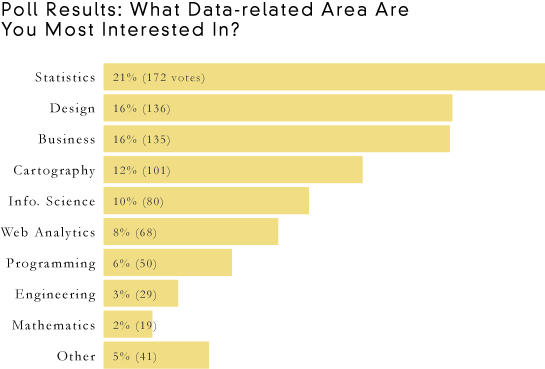
It’s perfectly fine, but there’s just one problem: you can read it, and when you’re trying to do ugly, readability is a no-no. With ultimate confusion in mind, let’s move on to our six easy steps to ultimate ugly.
1. Use Lots of Pretty Colors
The most obvious problem with the original graph is that it’s not nearly colorful enough. All the bars are the came color with black labels. Seriously. What’s that about? We need to make this graph sing with bright colors, and lots of them. In fact, the more your graph looks like the technicolor dreamcoat, the better.
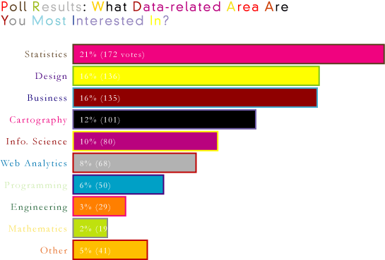
Much better. It’s looking good already.
Please note the insignificance of color choices. Give as little thought to what colors you use as possible. When you try too hard, the reader will feel like he has to try hard to understand what’s going on and therefore ignore the graph completely.
2. Make it Unitless
I specified percentage and votes in the original graph, which is just plain stupid. Units clutter and are utterly useless. Readers are smart enough to figure that stuff by themselves. Remember you want to make the reader think for a very long time. It should take hours before someone knows what your graph means.
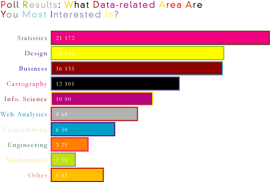
Ah, bright and ambiguous, just the way I like it. I am sure you agree.
3. Forget About Sorting
Forget about sorting values numerically or alphabetically. This goes back to the previous lesson. You want to make the reader think. It’s all about time consumption, confusion, and deep pondering.
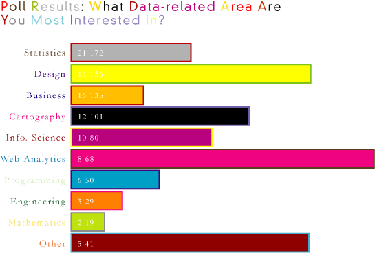
That’s better. Now it looks more human i.e. random. Graphs that look like a computer made it are dry, sterile, and boooorrring.
4. Spell Incorrectly
Typos are a perfect opportunity to make sure your readers are paying attention. Try using numbers in place of letters or removing words completely to keep things interesting.
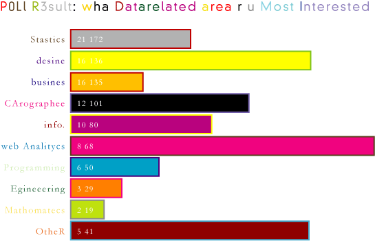
There’s a reason why YouTube is so successful – the lively and insightful, almost illegible discussion of all the videos. U WNT ur c0pee to l00K just LIKE C0mm3ntz 0N U2be vidyos.
5. Use Decorative PIctures
So far this graph looks a lot like, well, a graph. Graphs bore people, and if you want to get your point across, you’ve got make it look like art or a comic even. Add decorative shapes and pictures to really make your “graph” pop.
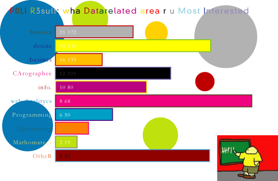
That’s more like it. Now we’re getting somewhere. Is it a graph? It it a comic? Is it art? I don’t know. Maybe all the above. One thing’s for sure though. It’s darn ugly, which is exactly one we want.
There’s just one more step to make your graph pure ugly!
6. Arrange Everything Uniquely
Now is your chance to catch people off guard. Arrange everything so that your graph looks like none of the other graphs out there. Make your readers look for the title, and don’t make it too easy to glance over.
Oh, and let’s not forget Comic Sans font. Don’t you just love it? Smart and sophisticated with a touch of humor. Graphs are fun, so make your graph look the part.
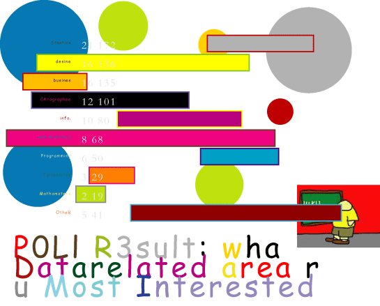
There you go, ladies and gentleman. There are your six easy steps to making your very own ugly graphs. Go out and amaze your co-workers and wow the rest of the world who don’t know what they’re doing.
One more thing…
In case you’re oblivious to sarcasm, the above six steps are a guide for what not to do, so for all that is good and pure please don’t actually follow them. If you want a proper guide, just follow this in reverse and do the opposite of each step.
There is a takeaway here though. When learning to visualize data, it’s just as important to learn what not to do as it is what is to learn what is right. You can read about “the rules” in a book all you want, but if you really want to learn, like all things, you have to practice.
So what did I miss? What other graphing pitfalls did I miss? How can you make this graph even uglier and more illegible?


There’s no 3D!
Every graph has to escape flatland (I read that in a book somewhere) and the best way to escape flatland is to make the bars of the chart rise off the page with 3D drop shadows…
[Apologies to Tufte]
Use 3D cones instead of bars. …with drop shadows.
nice reference to Flatland by Edwin A. Abbott
All the bars are the *came* color with black labels… maybe this should be “same”.
As for the unreadable graph, not labeling the values was nice, but what about using two poorly scaled axes and not labeling either one…
To be fair, shouldn’t the original title be “In which data-related area are you most interested?”
I know American-English isn’t so bothered about ending a sentence with a preposition, but you started the nit-picking!
rules are meant to be broken. some of them at least :)
Actually, the “don’t end a sentence with a preposition” rule is more of an urban legend than a legitimate rule.
One could also argue that “interested in” is idiomatic (as opposed to something like “located in,” which is literal) and therefore the two words should be kept together, not put at opposite ends of the sentence… but that’s splitting hairs. Bottom line: rearranging a sentence to avoid ending it with a preposition often results in a stilted sentence that’s more difficult to parse.
– a former English teacher
Where’s the 3D pie-chart, complete with Legend of subtly different colours? I was scrolling down, sensing it was coming…maybe you’re doing that in Part II tomorrow “Just when you thought the chart couldn’t get any worse…”
Great post.
Your text and descriptions were entirely clear and readable.
There’s not enough “designer speak”. I’ve read so many articles by designers of all walks, whose jobs are to make interfaces and devices that are cool and easy to use.
But when they *talk* about their inventions, they try to philosophize, invent words, and obfuscate simple concepts. I think they are trying to appear “scientific”.
So you should stop speaking so directly, and explain your graph with words like “minimalism”, “abduction”, “problem domain”, “post-ante-modernism” and “cognitive perception”. Heck, make up your own!
Oh, and how ’bout some Flash animation and something to do with Twitter?
Thank you, what a nice way to start the day, with a big smile.
I think drop shadows of all kinds, will made the chart complete.
You forgot about “Use high precision numbers”. The graph would have been much more informative if the percentages were more precise, i.e. instead of 21% use 20.697954271961492178098676293622%
You also need some motion, rotating, spinning. random jittering. And some unrelated music! Com’on! Let’s get this party started!
I enjoyed this post. But I wondered who your audience is. So many of the graphs I see already follow your advice.
Please,
Have you never picked up a copy of Wired?
How can you junk up a graph when you are using filled rectangular areas for the bars? Break out Adobe Illustrator like all the best prepress folks do and replace the readable and comparable filled areas with a texture or repeating image to really destroy the ability to compare.
Also you have missed out the ITN / CBS / Fox basic staple of not starting the bar height at zero and failing to say so…..
I can never figure the NYT’s charts and graphs; am I alone in this?
the new york times? i think you might be
Two words:
gradient fill
it’s like having two or more colors in one, yay!
You forgot to use a legend! You must never label your data directly, but instead make people look up the colours in a not-so-nearby legend (which, needless to say, should not be in the same order as the data series)
Additional improvements:
Change the width of your bars – or replace them with pictures of something, preferably 3D so we have a choice of volumes/areas/lengths to compare by.
I’m glad to see you have some yellow text to make sure it’s invisible in a powerpoint presentation, but what if it’s printed and photocopied? It’s important to make sure many of your colours have the same, dark, luminosity in case this happens. Especially important when using a legend.
Ha! Awesome.
When I saw the headline I immediately thought it has to be 3D and gradient filled, as some people before me have suggested already. But this is brilliant. Thank-you, you’re clever.
Congrats on creating the first FlowingData poster! It’s a looker.
haha. i hope people appreciate the time and effort i put into it. i can’t wait to put this up on my own wall
No body create chart like these ,you are quite æ— èŠçš„ , nothing to do ? I am hoping to see your diagnosis to?with? the real biz chart : )
you forgot the high density griddlines! .. along with big fat axis with lables every unit and subunit…
You integrated a 7th into #4,#5, and #6. I call it “Font abuse”.
2 font max – a rule never to be broken… like you did in this fun example
You forgot the most important part:
Don’t plot the important data.
One other thing…make sure your percentages don’t total to 100% :)
drat. i left some accuracy in there
My improvements (some are already mentioned above):
* Textures
* Gradients
* Reflections
* Shadows
* Transparency
* Not aligning the data (putting the data on the right end of the bars)
* Grouping labels in a neat color-coded legend
* A bit more non-data ink please
I’m sorry I can still take out my ruler and compare the lengths of the bars to each other. A great chart needs to hide the scale into some arcane atttribute of the graph.
Let’s pick a different icon for each group and scale each by its area.
Remember – true ducks always lie!
Comic Sans was the real kicker for me, but I think you could have spiced it up with a little Papyrus here and there as well.
My Eyes!
In regards to your “Arrange Everything Uniquely,” when you tweet your bars, you won’t have an origin. There is something to the reality of an asynchronous, baselineless, origin-free bar.
In the database to data warehouse trip, these origin-free bars get stacked. This has nothing to do with graphics design. It’s a reality that histogram bars stand alone, and play in origin-free space.
Pingback: links for 2009-06-15 « Boskabout
Too much consistency in the bars! Try mixing things up with a pie chart for 3-4 of the responses.
For some reason, there’s something about Comic Sans that people find comforting. It says “look at me, I am accessible to you because I have a playful and unsophisticated look”.
Comic Sans is like the Sarah Palin of fonts, except without the $180k makeover budget!
Remove #4 and you’ve created a graph for Good Magazine.
I think you forgot the preliminary step – start with Excel’s defaults! That initial bar chard you started with is way too clean! And of course you must add 3D chartjunk. For percentages, its even better to have a pie chart that is broken out so that wedges of different sizes (and of course shades, colors, gradients, and fills) are scattered about – in 3D! That would really make it impossible to figure out any real data!
Umm… shouldn’t the original have been a pie chart in the first place?
A really dark background is de riguer these days; that repeating graphic thing someone mentioned above is a fine approach, so long as it’s dark.
This will have the devilish clever effect of making your graph all but impossible to read unless it is printed out, and simultaneously as expensive as a mortgage actually to do so. Extra credit given for a color choice that is all but indistinguishable by a typical monochrome printer from the dominant foreground colors.
Readers will spread palm fronds in your path!
Excellent post – very informative. The user comments cover all the missing design elements that could truly bury your data under a heap of chart junk (e.g., textures, gradient fills, drop shadows). I can add only three more: use areal symbols to represent values on a linear scale; invent a text hierarchy that conflicts directly with average readers method of reading; and include a title that is larger than your graph (48 pt or larger).
‘Comic Sans is like the Sarah Palin of fonts’ – that’s awesome Mike!
That last image is SO HILARIOUS
This is Junkcharts backwards–there they take an actual (bad) graph and explain how to make it work
Pingback: ToolBlog » Beispiele zur Präsentation
Good post but you are missing one important aspect. Often color can give your chart more value in the meaning of significance.
An example can explain this better: If you want to tell your audience that most people are interested in statistics this statement could be underlined by a bar colored differently to the others.
Stefan
Pingback: interactive visualizationist VS infographicist | Erqiudao
Interesting article. Almost had a seizure going through those charts. Weirdly enough, I found this article via google while searching for ‘good’ charts…
For those who are interested, also found National Center for Education website. Which seems to be the most popular. And ChartGo They’re both pretty useful.
Your references to graphs and graphing are so 2008! Have you been comatosing on Propofol in Google screen whitespace or what? Nobody GRAPHS anymore, we DASHBOARD now. Dash it all, didn’t you get the iPhone app d/l from the satellite? How are top echelon leaders and motivators in my company supposed to operate executive decision support systems without driving permissioned and personalized enterprise portals replete with sparklines, key performance indicators, balanced scorecards and traffic lights? Wake up and listen to the Twitter! We’re living in the post-future now. Oops, gotta go, Jorge Jetson just messaged his retinal scan direct to my hypothalamus. So long, been fun, HSM4 4-ever!