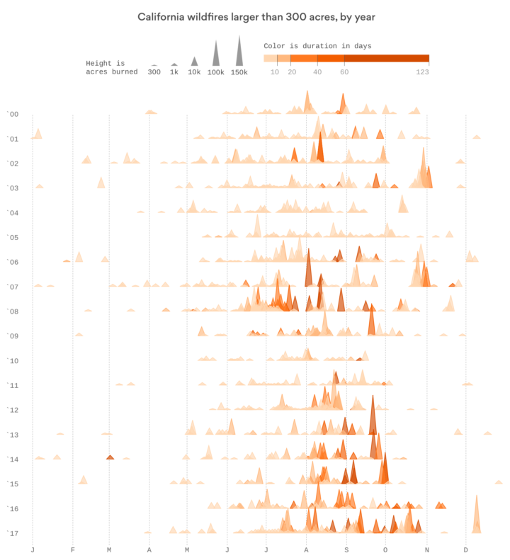
Based on data from CAL FIRE, Erin Ross, for Axios, plotted California wildfires that spanned at least 300 acres since 2000. Each triangle represents a fire, where the height represents acres burned (width is the same for all triangles) and color represents duration. The fires appear to be burning hotter and longer.
I wonder if it’s worth doubling up on the triangle encoding by using width to represent duration, similar to the Washington Post graphic made during the elections.


 Visualize This: The FlowingData Guide to Design, Visualization, and Statistics (2nd Edition)