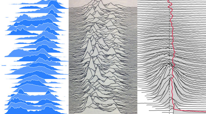
Frequency trails, or currently better known as joyplots, is a visualization method to show multiple distributions at once. Taken individually, each distribution is shown as a density curve, and they overlap each other for a three-dimensional effect. Luis Carli provides an interactive explainer for the method.
I haven’t been able to put my finger on it, but I think there’s something about the overlapping that sort of serves as a visual signal to compare. It seems more direct than small multiples or non-overlapping densities? Or, are people just appreciating the novelty for now?

 Visualize This: The FlowingData Guide to Design, Visualization, and Statistics (2nd Edition)