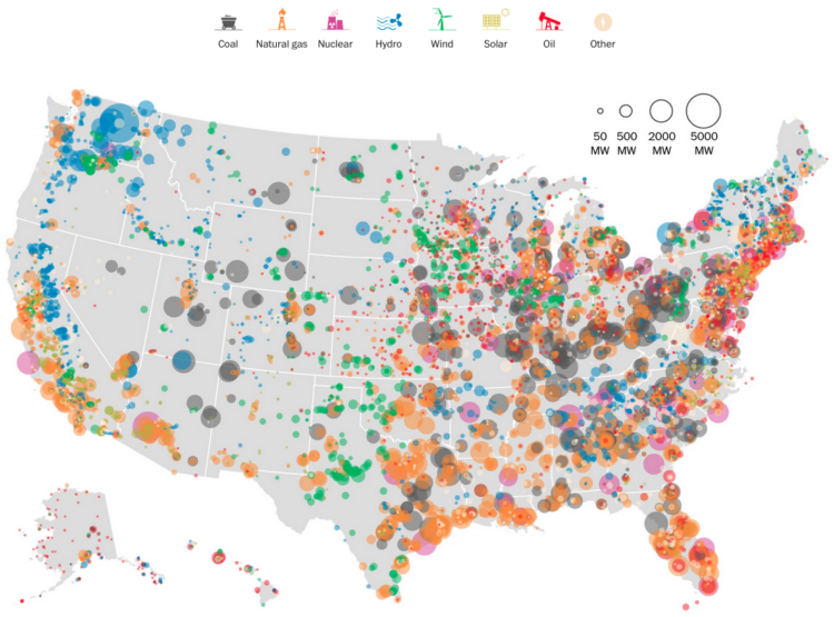
The Washington Post mapped power plants in the United States by type and capacity in megawatts. Color indicates the former, and bubble size indicates the latter. There are a lot more natural gas power plants, supplying 30 percent of the nation’s energy, than I expected.
See the article for a map for each type, along with a state-level breakdown.

