Relationship Status Geography

Some places attract young singles, whereas others attract married couples and families. Something obvious made even more so when I stayed in the city for the weekend, away from my small slice of suburbia. I was curious how this varied across the country.
In The Information Capital, a book of maps and charts about London, James Cheshire and Oliver Uberti mapped relationship status for their region.
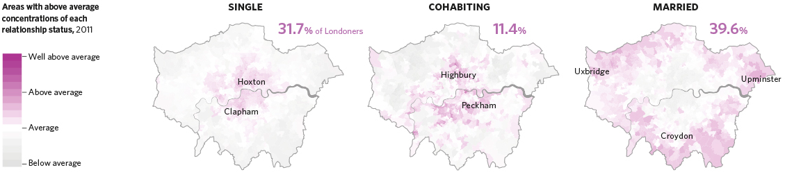
The book about London — who the people are, where they go, and what they do — is a fun one to flip through. Probably more so if you live in the city.
Anyways, as is usually the case, you see patterns in one area, and you wonder what it’s like where you live. So I grabbed data on marital status from the American Community Survey. It only goes down to the county level unfortunately, but you can still make out geographic patterns.
Let’s have a closer look at the marital status of America: married, never married, divorced, separated, and widowed. There was no “It’s complicated” status in the ACS.
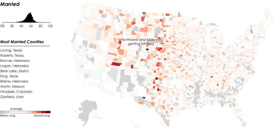
About half of the population aged 15 years or older are married. That large portion surprised me. I mean, I’m married, most of my friends are married, and I guess a large portion of my cousins are married, but still. I guess when you really think about it, half of the marriageable population isn’t that high.
That said, some areas have higher percentages of married people compared to the rest of the country. In particular, the Midwest, Utah, and parts of Idaho and Montana are high up there.
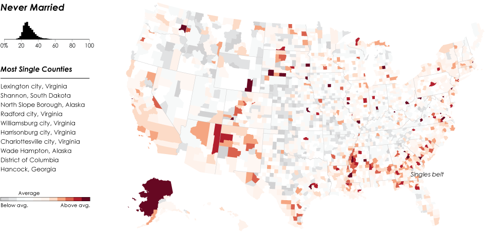
In contrast, when you look at areas where there are relatively more people who have never married, you get the reverse of the married people map. That belt in the south that stretches west to where Mississippi, Arkansas, and Louisiana join is an interesting cluster. Although I’m not sure why it’s like that. (Update: Cotton might have something to do with it.) A similar pattern shows up on later maps too.
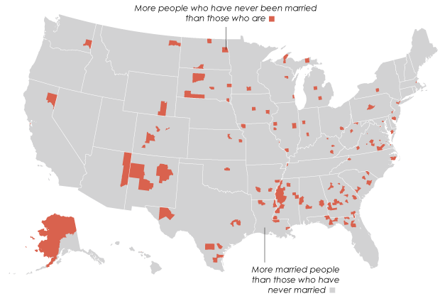
Overall though, in most counties, there are more married people than single people. There are about 150 counties where the order is reversed.
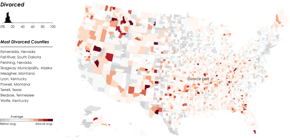
Just above the singles belt: a divorce belt. Again, I’m not sure why that pattern is there, but it seems interesting. That said, the higher percentages of divorcees are in the Northwest.
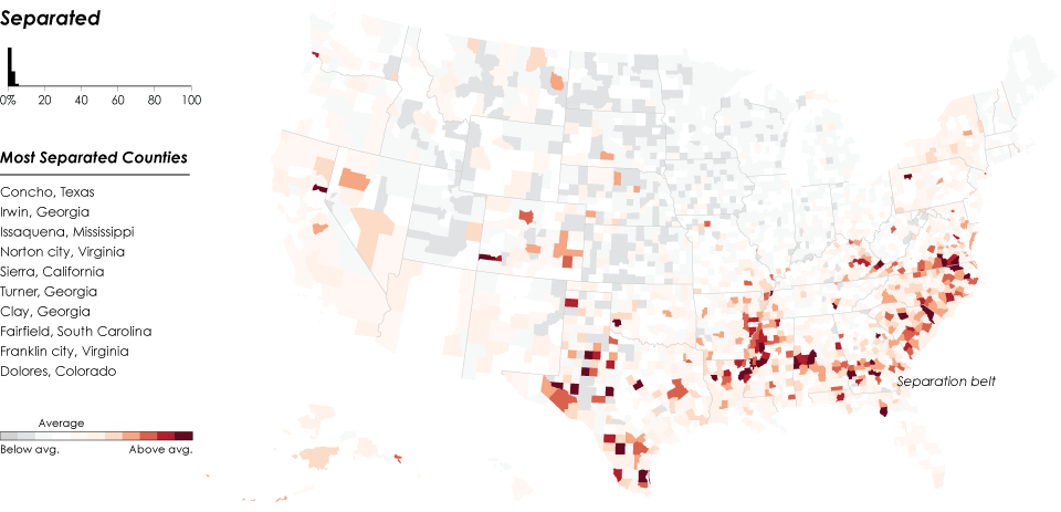
Only two percent of the 15 and older population is separated — still married but not together really — and this in relatively higher percentages in the south for some reason. Is it just more common to separate instead of officially divorce in these areas?
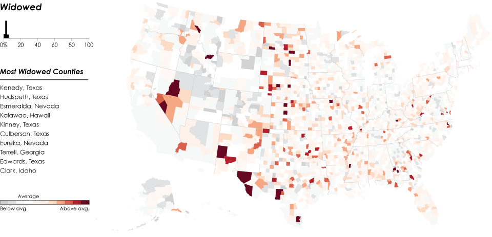
About six percent of the marriageable population is widowed. There isn’t a lot of clear geographic concentration, other than the little bit in Texas and Nevada.
Chart Type Used

Become a member. Support an independent site. Get extra visualization goodness.
See What You Get