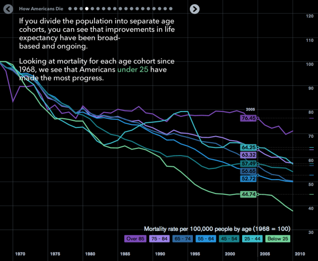
Matthew Klein for Bloomberg View explored mortality in America through a slidedeck of charts. The animations in between each slide grows tedious, but the topics covered, going beyond just national mortality rate, are worth browsing. (Although, can someone tell me why the female mortality rate rose between the 1970s and 2000? I know there’s a perfectly valid reason behind the trend, but I can’t remember.)
The data itself is also worth your time, in case you’re looking for a side project. It comes from the Centers for Disease Control and Prevention and spans 1968 through 2010.
I can tell you from experience the data query process isn’t the smoothest experience — as much as you can expect from a government site, I guess. That said, the amount of data, with a variety of demographic breakdowns and categorizations, can make for plenty of worthwhile projects. Highly recommended.
 Visualize This: The FlowingData Guide to Design, Visualization, and Statistics (2nd Edition)