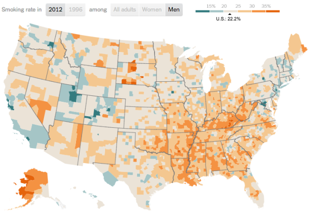
Based on a study on smoking prevalence from 1996 to 2012, a map by The New York Times shows the results. Smoking rates among men and women have declined overall over the years, but there are still relatively high rates in many areas of the country, which appears to correlate with income. Lower income tends towards higher smoking rates.
That would explain why the map above looks similar to a county-level map for median household income, which probably interacts with life spans by county somehow.
 Visualize This: The FlowingData Guide to Design, Visualization, and Statistics (2nd Edition)