The quality of television shows follow all kinds of patterns. Some shows stink in the beginning and slowly gain steam, whereas others are great at first and then lost momentum towards eventual cancellation. Using data from the Global Episode Opinion Survey, Andrew Clark visualized ratings over time for many popular shows in an interactive.
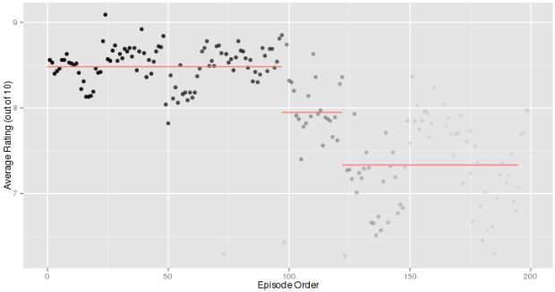
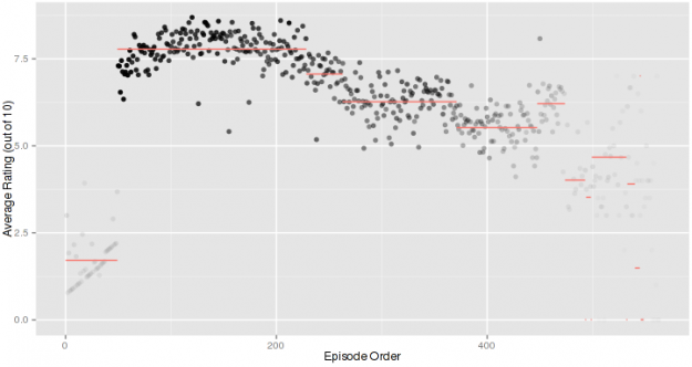
The graph represents the average ranking for the show over time. The red lines indicate changepoints, estimations of when the properties of the time-series, typically the mean changes. The intensity of the plot varies according to the number of respondents. An episode of a show that is favourably rated tends to get more people ranking as do earlier episodes in long-running show.
For example, the chart above shows ratings for 24. The ratings started in the 8s and finished in the 7s, which isn’t a huge difference really when you compare it to ratings for The Simpsons.
There’s a self-selection challenge here. To participate in the GEOS survey, you have to create an account, so there’s probably going to be some polarity in the ratings as well as limited sampling for many episodes. So take it all with some salt. Nevertheless, it’s fun to poke around and see how your favorite shows changed over time. Most of the ratings matched my expectations.
The R code is available on github if you want to have a go at the data.
 Visualize This: The FlowingData Guide to Design, Visualization, and Statistics (2nd Edition)