The elections season is in full swing, and the New York Times graphics department ramps up its election coverage. With newly hired Mike Bostock teamed up with the Times’ interaction guy, Shan Carter, I’m sure we’re in for some interesting work.
The two, along with Matthew Ericson, covered the words used at the Republican and Democratic Conventions, but yesterday they put up an interactive that shows the words used at both conventions.
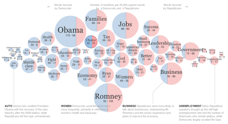
Each bubble represents a word, and the bigger the bubble the more often it was used. The blue and red split compares word usage of Democrats and Republicans, respectively, and bubbles are arranged horizontally left to right, from words favored by Democrats to those favored by Republicans. For example, “forward” is far to the left, and “fail” is far to the right.
While the visual provides a sense of what was talked about, the best part is that the visualization is an interface into the transcripts. When you click on a word, quotes that use that word are shown, so you can see what was actually said alongside keywords. Plus, you can enter your own word or phrase, and a new bubble is placed accordingly with the corresponding text on the bottom.

 Visualize This: The FlowingData Guide to Design, Visualization, and Statistics (2nd Edition)
I found that to be a very interesting text mining technique.I wonder how many companies use similar techniques to do text mining of their own data?
Just in case anyone is interested, here is a tutorial that goes over some of the technical details on how this visualization was created:
http://vallandingham.me/building_a_bubble_cloud.html
Wow. Awesome graphic. This is amazing how it really shows what the main points each party is trying to campaign for. Never would of thought to organize it this way.
Smart chart for a fuller understanding of democrats vs republicans!