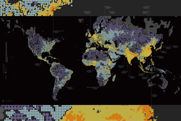
Form design intern at Fathom, James Grady, maps population density in Dencity:
Dencity maps population density using circles of various size and hue. Larger, darker circles show areas with fewer people, while smaller, brighter circles highlight crowded cities. Representing denser areas with smaller circles results in additional geographic detail where there are more people, while sparsely populated areas are more vaguely defined.
While we’ve seen population density mapped, both directly and indirectly, the circle approach adds a different aesthetic that seems to add something about what it’s like to live somewhere. Compare to a broader country-level map or one that uses only color. Doesn’t this version feel like more?


[Fathom via Fast Company]
 Visualize This: The FlowingData Guide to Design, Visualization, and Statistics (2nd Edition)
I’m not sure how much I like this way of visualising population.
Pro: The visualisation clearly conveys that the data is at a relatively rough level of detail. The dots form a discrete tesselation of space (more so, than a space-filling grid at constant resolution; like http://en.wikipedia.org/wiki/File:World_population_density_1994.png).
Con: Like you mention, one has to first bend one’s mind around what the circles stand for. From many visualisations we’re used to associating bigger circles with “more” (like in the country-level map, https://flowingdata.com/2011/10/31/7-billion-people-in-the-world-past-present-and-future). Furthermore, some distracting (in my opinion) effects occur where arbitrary “whitespace” (or here rather: blackspace) occurs because of the discrete arrangement, and discrete sizes, of circles. This is especially visible in the middle picture.
As a geographer I’m used to looking at space-filling gridded raster data. If one opts for this traditional approach (also known as heatmap to some), it’s to find a suitable colour palette and, if applicable, histogram stretching method. Also the choice of visualising gridded data on a continous colour palette vs. a set of intervals/classes affects the final result strongly. The conventional gridded representation usually also allows for semi-transparent superimposition of a second space-filling dataset. This can be interesting for studying or highlighting relationships between mapped variables. In case of population numbers e.g. relief could be an interesting second variable to compare to.
I am seeing like 3 or 4 layers of abstraction for a single variable. “Doesn’t this version feel like more?” what check boxes were left unchecked in this software?
It is useless for trying to judge low density populations it looks like the baseline for low density populations was set at too dark of a hue with too large of circles, those regions simply disappear or are not represented. Even in dense regions it leaves gaps that betray the false illusion of accuracy.
I imagine the circle size inversion will be somewhat controversial, but I think I like the concept. As you say, “adds something about what it’s like to live somewhere” – it’s basically visualizing “personal space radius”
Thanks for sharing! Love the color palette.
Do we know what source was used for the data? Also, it appears (from a zoomed out level, anyway) that black was used for both uninhabited places (namely, water) as well as for places that I guess may simply have extremely low populations, or may be “low number events” or “N/A”–that is, too low to graph? “For example, large parts of Australia, parts of US midwest, etc. If so, am wondering if water can be differentiated from those places in some manner? (And, technically, I suppose LNE and N/A shouldn’t really be treated the same, either.) I know it’s tough to find accurate and complete data at the country level, so it’s always nice to see what’s available and cool new ways to display it.
A nice picture, and I like the idea, but this is dwarfed by the fact that it appears to use a Mercator projection, making this only about esthetics, and not information. I am sorry, but I can’t take any world analysis using Mercator seriously….
As it is not equal-area, we have to ask: if circles are scaled to population density, this means that one circle represents a lower number of people in northern Germany than in southern China?
Nice map, very educational. South-Western Europe is not so populated as central. There are still a lot of place for europeans to live. By the way, found also interesting place – real time population counters: http://countrymeters.info